Support for

We want the same thing that you want. We want your graphic files to print correctly first time and look like you meant them to. Below are the minimum file supply essentials you need to follow.
If you are designing something more complicated like a booklet or a StarMarque/Spot UV product, take a look at our detailed File Supply Guide or get in touch before starting your design.
Remember to check the you have set your page size to match the product that you are ordering. Some products may have special sizes or bleed requirements. Most products generally have 1.5mm bleed on each edge, but there are some exceptions such as Booklets and Large Format Posters.
Artwork files should be supplied without crop marks.
Files supplied without a bleed will be scaled up to create the required bleed, which may result in printed elements appearing closer to the edge than expected.
Always choose a template appropriate to the orientation of your design; it’s best to have text reading ‘upright’ on screen. If it’s not possible to design the text ‘upright’ (maybe, you need a landscape front and a portrait reverse), then you must ensure the generated artwork’s front and reverse are oriented as you need. (We impose Right to Left, place pages side by side to check the orientation of your document and view our examples here.
The quiet or safe zone may vary depending on the product ordered, you’ll need to check that you don’t have any important elements in this area. For most of our products we ask that all important elements are 4mm away from the cut edge, or 5.5mm away from the page edge. Elements within this area may appear closer to the edge than expected when guillotined and often result in an uneven looking design.
The use of designed margins or uniform borders near the product edge is strongly discouraged because guillotine cutting is not accurate enough to ensure that margins will be of the same width on every edge. Even a 0.5 mm movement in the guillotine blade will make the margin look uneven. Our guillotine tolerances are ± 1 mm for Litho Products and ±2 mm for Digital and Large Format.
When saving your file, ensure that you have set the artwork up in the correct colour mode for the product that you are ordering. Most products are produced in CMYK process colour. If RGB or LAB colours are found they will be converted to CMYK which will result in some colour shift. We do not recommend supplying files in RGB or LAB as it's unlikely they'll print as expected. Pantone Colours will also be converted to CMYK (where applicable) with the same results.
An example of an image supplied in RGB:
.jpg)
.jpg)
The same image once converted to CMYK:
%20600.jpg)
%20600.jpg)
Colour variation is inherent in any print process, unfortunately an exact colour match cannot be guaranteed and should not be expected. The example below will give you an idea of how your chosen colour may actually look when printed. It's worth bearing this in mind when placing orders for multiple sets of business cards and reorders as colour variation affects each printed job and can also vary throughout a print run; due to air temperature, humidity and many other factors outside of our control.
Colours made up of 2 or more CMYK colour channels increase the amount of variation you can expect to receive.

Example: 1 CMYK colour channel (Cyan)
Example: 3 CMYK colour channels (Magenta, Yellow & Black)
Colour charts are available for our main paper and card stocks and can be used to get a better indication of your printed colours.
Make sure all colours are below a 300% total ink coverage for coated papers and 225% for uncoated. Lower limits apply to some papers, take a look at our full guidelines for recommended ink levels.
The rule of thumb:
• Avoid using more than one colour channel for Black Text (100% K only reduces the likelyhood of misregistration, which results from aligning multiple plates with fine details).
• Use a Rich Black (100% Black (K) and 40% Cyan OR 100% Black (K) and 40% Magenta) for areas over 2cm squared in size to avoid banding as single colour blacks can appear washed out when printed across large areas.
• Avoid using Colours with an ink limit of 225% for Uncoated Stocks and 300% for Coated Stocks to reduce the likelihood of set-off, which is when ink transfers from one side to the other during guillotining.
When paper is folded, its interlinking fibres are compressed on one side and stretched on the other. If the outer fibres lose their hold on each other, we see this as 'cracking': an opening out of the paper on the outside. This will be more visually apparent where the design includes a dark colour across the fold. If dark colours are required please upgrade to a Laminated Product which will help to reduce the appearance of cracking. This affects any product that is creased or folded such as Folded Leaflets, Creased/Shaped Flyers and Presentation Folders.
Remember to check the requirements for the resolution of images, as it may vary for different products. For CMYK process printing, your colour images should be set to 300dpi @ 100% size.

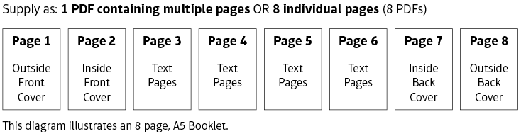
Ensure that you supply us with the correct number of pages in your file. You can supply your pages as individual PDFs or as a multiple page PDF. Page 1 should be supplied as the front design, page 2 the reverse and finishing on page 3 where appropriate.
Remember to check that you are saving your file in the correct format for the product that you are ordering. We would prefer you to supply us with a 'Press Quality' PDF (Compatability: Acrobat 5 (PDF Version 1.4) or later). Take a look at out full list of accepted formats.
InDesign templates are available for 99% of our product range. Templates offer an "assured" starting point for your supplied files. For Fabric products refer to Using InDesign TGI Templates for Fabric article.
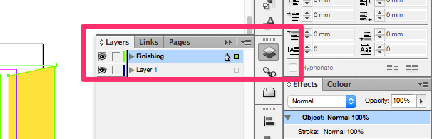
 InDesign Layers
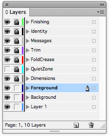
| Layer Name | Notes |
|---|---|
| Foreground | Printable layer: Your regular artwork layer, where you place your design. |
| Dimensions | Guidance only: Shows sizes of some features such as page and trim guides |
| QuietZone | Guidance only: Areas that you should leave clear of important elements such as text and logos. |
| FoldCrease | Guidance only: Identifies fold and crease positions (where there are no die-cut guides) |
| Trim | Guidance only: Shows our trim guides for guillotining |
| Messages | Guidance only: Hints about the product or spec. |
| Identity | Guidance only: Product code, template generation date and update version number. |
| Finishing | Printable layer: Finishing elements that must be topmost on the artwork and are required for printing die-cuts, spot uv and folders (Folder Style ID box for example). |
These Visual Aids are not required for printing and are removed by FileCheck (status 021). They should not appear on your "Print Ready PDF".
It's best practice to leave a 3 to 5mm margin (Quiet Zone) between your text and logos and the trimmed edge for Litho printed jobs.
Booklets, Banners and Fabric products have much larger Quiet Zones.
The Quiet Zone is marked in the blue QUIET-ZONE colour, on the QuietZone layer. This layer is hidden by default, and can be revealed by clicking on the ‘eye box’ (leftmost column) next to the QuietZone layer in the Layers palette.
The Quiet Zone Guide should not appear on the "Print Ready PDF" and is removed by our FileCheck Software.
These are marked in our purple TRIM-GUIDES colour, on the Trim layer, showing where the product will be trimmed. The tolerances for guillotining are -/+1mm. These elements should not appear on the PDF you send to print.
The Trim Guide should not appear on the "Print Ready PDF" and is removed by our FileCheck Software.
These are marked in the FOLDING-GUIDES colour, on the Fold layer, showing where the product will folded. The tolerances for folding are -/+1mm. These elements should not appear on the PDF you send to print.
The Folding Guide should not appear on the "Print Ready PDF" and is removed by our FileCheck Software.
-1.jpg)
A red page frame is drawn to indicate the front panel on the finished item.
The Red Page Frame Guide should be present on your "Print Ready PDF".
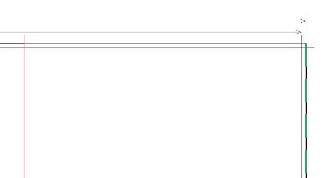
Where a simple perforation option is specified on leaflet products, the parallel edge closest to the perforation is marked with a dashed green+white line.
The Perforation Guide should be present on your "Print Ready PDF".
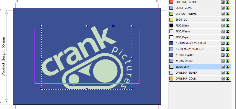
All of our templates include our die-cut, spot uv, gold or silver foil spot colours.
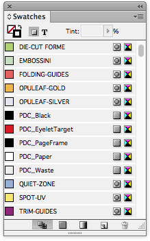
Add 2pt Strokes to the Finishing layer, using swatch colour: DIE-CUT FORME.
Add solid shapes to the Finishing layer, using swatch colours: OPULEAF-GOLD or OPULEAF-SILVER.
Add solid shapes to the Finishing layer, using swatch colour: SPOT-UV.

Add solid shapes to the Finishing layer, using swatch colour: EMBOSSINI.
For Banners having eyelets, TGI will place eyelets with the correct spacing. This also works with custom-sized Banners.
We want your graphic files to print without fuss and look exactly like you meant them to. We’ll be honest with you – of the small number of jobs that don’t print as expected, the overwhelming majority are from files supplied to us. Even if you’re a seasoned professional and are used to supplying files for print, please read these guidelines anyway – our process is likely to be different to what you’re used to. If you’re designing something complicated, please call us before you start or look at our ‘How To’ guides.
Upon receipt of your PDF, we’ll perform an automated FileCheck of your file to ensure that it meets our production requirements. Our FileCheck is industry leading, and will correct many common issues ready for print.
Sometimes we can’t correct a file, such as a low resolution image, and in this case we’ll contact you to confirm how to proceed. If we have to make manual corrections to your PDF, a small fee may be incurred.
Yes, absolutely. We prefer PDF files, but if you don’t have one then we’ll be able to work with your native files. Please call us to discuss your project further.
It’s very important that you set your page size correctly. If you don’t,
parts of your design may be chopped off, look off-centre, or have
areas of undesired white space. Here’s what to do:
Locate the product size you’re interested on the Common Sizes page.
Make a note of the Page Size. This is the size you should set your page on your document.
Now look at the Trim Size. You’ll see that this is 3 mm smaller on both dimensions. This difference is known as the ‘bleed’ – 1.5 mm on all four sides – that’s approximately where our automated guillotines will make their cuts. The bleed allows for any small variations in during the cutting process. We recommend that if possible no objects extend beyond the page size – use the ‘paste inside’, ‘clip’, or ‘crop’ tool.
To remind yourself where the cuts will be made, you could add some guidelines 1.5 mm in from each edge on your document.
Here’s an example of a business card, you’d set your page size as 88x58mm. We’ll trim down to approximately 85x55mm.
.png)
It’s also good practice to leave a ‘Quiet Zone’ (or safe area) of 4 mm from the trim edge (that’s 5.5 mm or 11.5 mm from the page edge).
The same goes for any folds or creases. Avoid placing any important objects such as text or logos within this quiet zone. This will make your job look more professional and ensure objects don’t look like they’re about to fall off the edge.

We don’t require the normal colour bars and crop marks that printers use, so remember not to include them on your PDF.
Allowing for the correct bleed and quiet zone are really, really
important and they are some of the most common file supply errors
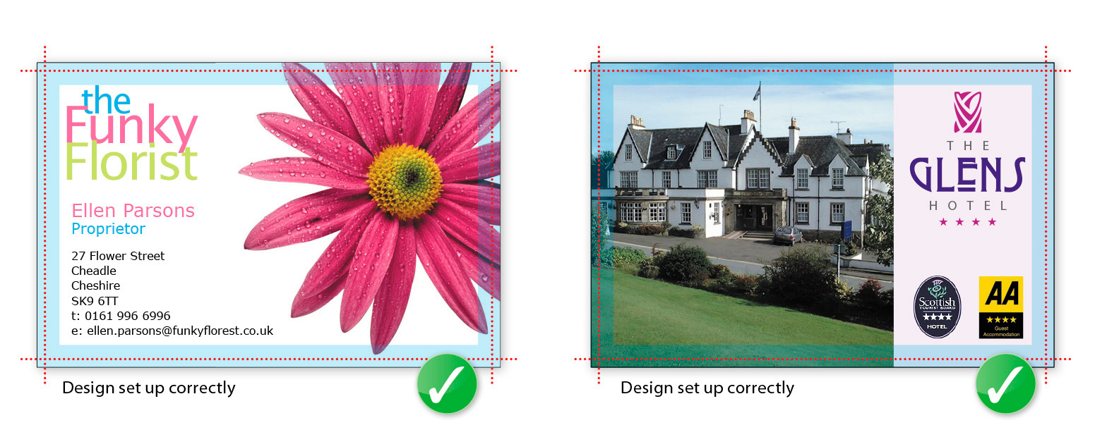
that we see. Here are a few examples of how to get it right (and wrong!):
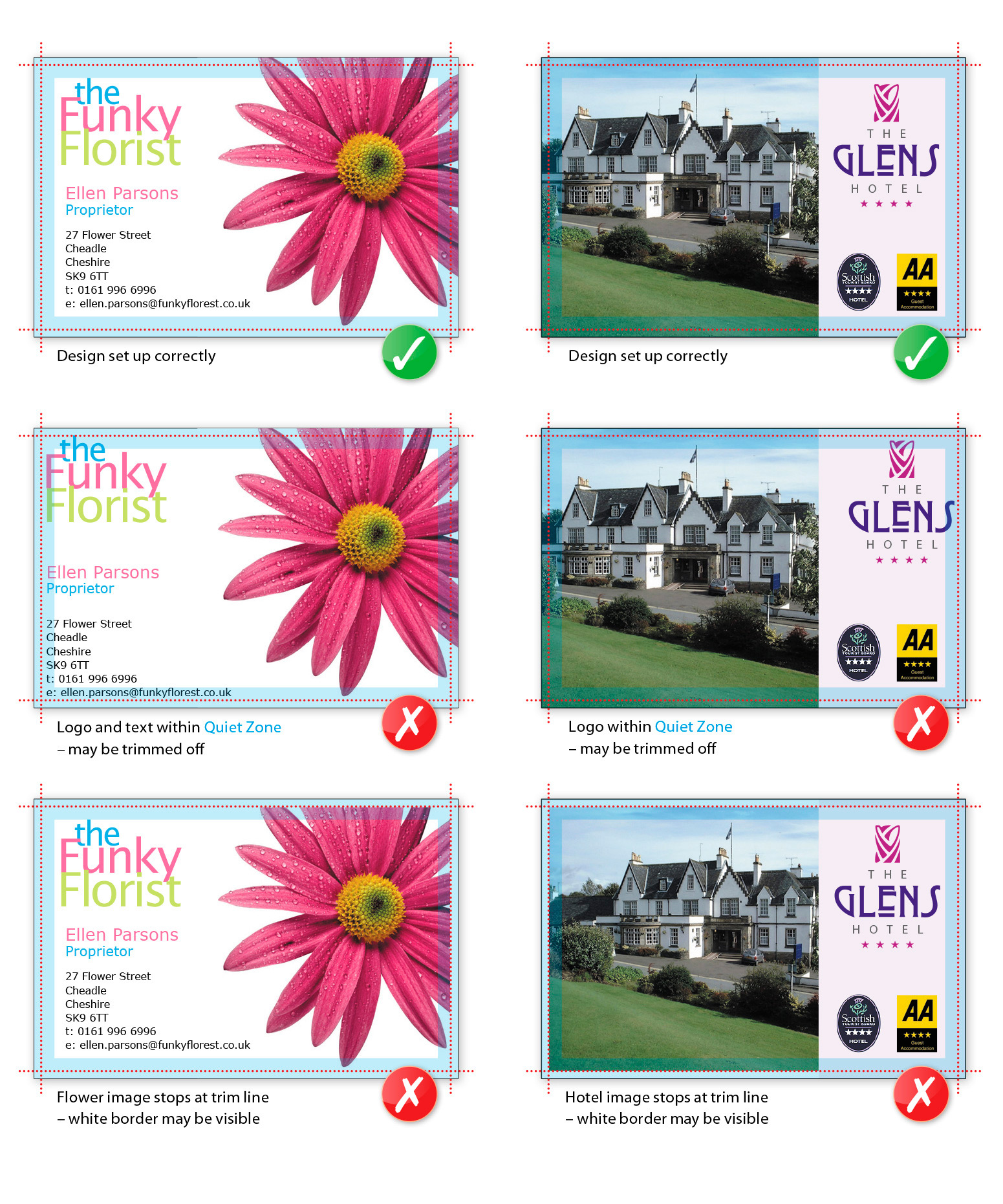
When viewing your Online Proof the QuietZone is indicated with Red and White Guides. The Bleed is highlighted in Grey.
Objects that enroach our recommended QuietZones may appear closer to the edge than expected once printed.

Always choose a template appropriate to the orientation of your design; it’s best to have text reading ‘upright’ on screen.
If it’s not possible to design the text ‘upright’ (maybe, you need a landscape front and a portrait reverse), then you must ensure the generated artwork’s front and reverse are oriented as you need.

Do not submit one landscape and one portrait side. Instead, rotate the artwork of one of the sides to conform to one of the examples shown here – make it fit a standard template.
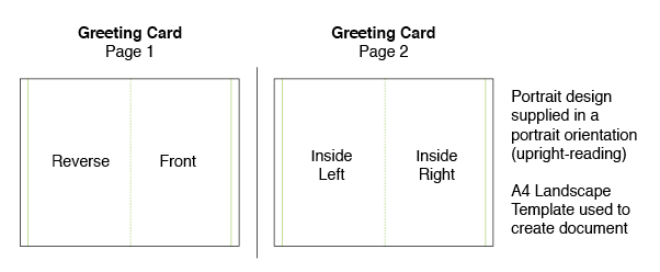
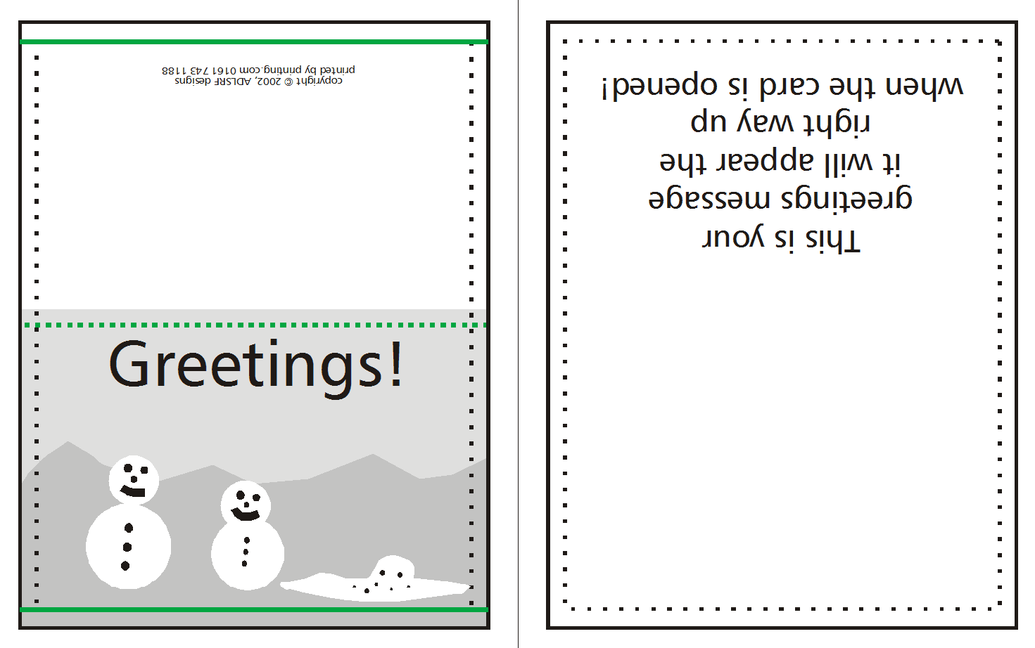
Be sure to check in the special case of ‘Greetings Cards’ products, especially the inside orientation of landscape cards.
As we impose from left-to-right, the message inside will print on the panel opposite to the reverse. Your files if set up correctly should look like this (the recommended option):

You can also supply like this:
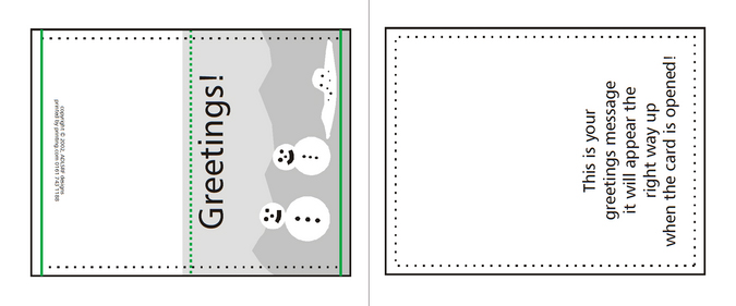
Or like this:
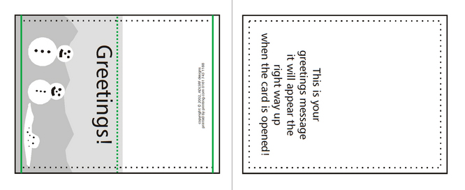
Your Portrait Greeting Cards will look like this:
Here are the common metric page sizes.
.jpg)
Your computer, scanner, digital camera and monitor create images using combinations of just three "RGB" colours:
Printing presses use four different colours to print these images:
This set of inks is known as "CMYK ", or "process colour".

At some stage of production, RGB images and colours must be converted to CMYK.
Your PDF file needs to be supplied in CMYK process colour, not RGB, Index or as Spot Colours. We can do the conversion for you to CMYK, but you will have more control of it if you manage the conversion before creating your PDF.
When converting to CMYK, it's important to be aware that some RGB and Spot Colours don’t have a direct CMYK conversion. As such, some colour shift may occur.
Conversions on images from RGB to CMYK are best done using software such as Photoshop and you should do this before sending your file to us.
If you don’t perform the conversion yourself, our process will apply an industry-standard profile RGB to CMYK conversion meaning that colours may not print as expected.
Due to the differences between a computer screen and a printed item, what you see on your screen may be different from your printed product. This is because computer screens have a light showing from behind them whereas paper doesn't.
To create a good solid black, use rich black instead (see Getting the most from Black for more details).
Don’t use four-colour black and it’s best to avoid solid colours of only one ink (i.e. pure cyan, magenta, yellow or black) as these can be susceptible to slight “banding”. Using rich black avoids banding.
You’ll get the best reproduction from colours that are made up of one or two inks (i.e. magenta and cyan etc).
When using lighter shades, avoid tints that contain less than 5% of either Cyan, Magenta, Yellow or Black, as they usually print much lighter than they appear on-screen and you may be disappointed with the outcome. For best results, use tints containing 5% to 30%.
Try to avoid large areas of the same colour – this is where colour issues (banding, ghosting etc.) becomes most noticeable. Try to break up large areas of colour with alternate elements or add a background image.
Vignettes or gradient fills are best avoided – they have a tendency to show ‘banding’ and look unprofessional. The Adobe® website offers some advice on gradients if you wish to use them.
You can produce fantastic results with full colour process, and without breaking the bank. It pays to bear in mind that colour variation is inherent in any print process and you shouldn’t expect a perfect match to your chosen colour.
The examples below will give you an idea of how your chosen colour may actually look when printed. We’d be delighted to explain this in more detail – just ask.

To get the most from your print, we've set some recommended maximum ink levels:
More information on ink levels can be found in Avoiding Set Off.
To optimise your images you'll need to consider the final size your images will be used at. Photographs should be 300-350dpi at the size you are going to use them. There’s no point taking a postage stamp sized image at 300dpi and then blowing it up to a A4 size. Conversely, photographs at more than 350dpi will have no effect on the actual printed quality and will unnecessarily increase file size and
processing time.

Adobe Photoshop psd files can be used in your PDF file, but you will need to save the PDF as a version 1.4 PDF or later. If you are saving as a version 1.3 PDF then you will need to flatten the images when your PDF is created.
Today’s graphics applications are incredibly sophisticated but may contain features that are incompatible with the latest developments in printing technology.
Likewise, some things can look great on screen, but not when printed.
Based on our experience, we’ve prepared a list of features we know can cause problems.
 Hairlines are ‘device-dependent’ - this means that they print at different resolutions on different machines. They may print reasonably well on your 300dpi laser printer but will disappear on our 2400dpi plate-setter. Use 0.25pt stroke weight instead.
These print erratically so it's best to save them as a TIF or JPG instead.
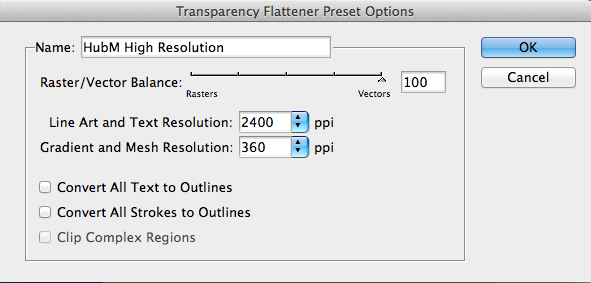
If you are using layer and transparency effects in your artwork, you'll need to supply your PDF as version 1.4 - this will ensure that any layer and transparency effects are honoured.
If you are saving as a version 1.3 PDF then your Transparency Flattener preset (in both InDesign® and Illustrator®) will need to be set on High Resolution setting ready for printing and applied again when creating/saving your PDF:
When working in Illustrator®, the Raster Effects Settings will also need to be set to vector:

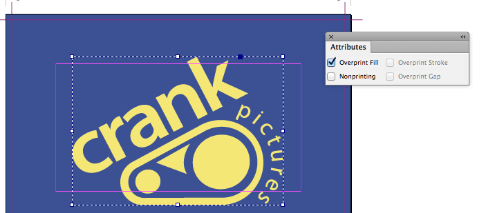
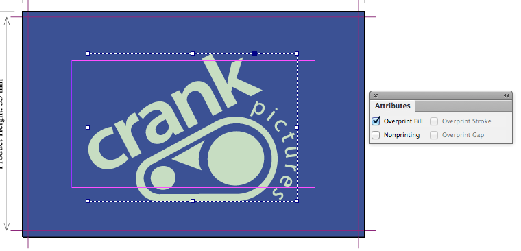
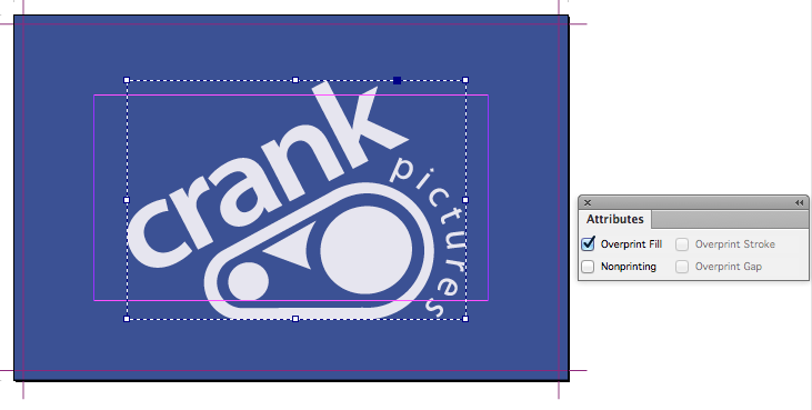
 Be careful with overprint settings (especially in QuarkXpress). If you set objects to overprint, they won't ‘knock out’ the background and will look very different to what you see on screen or proof.
Black text generally defaults to overprint as does the 100% black swatch in some applications (both of which are almost always fine). Please refer to your application manual for more details.
 These may print in black and white or with washed-out colours – you should always convert your artwork to CMYK first.
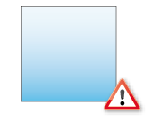
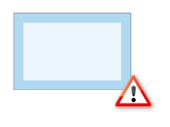 Movement during the guillotining process is inherent (NB -/+ 1mm for litho, -/+ 2mm for digital) and you should not expect the space between a border and the finished guillotined edge to be the same on every edge.
Even half a millimetre of movement can be noticeable, especially on smaller products like business cards, and can lead to an uneven/unprofessional look to the artwork.
 Vignettes or gradient fills are best avoided – these are difficult to print and they have a tendency to show ‘banding’ and look unprofessional. The Help sections on the Adobe website which you may find useful:
Indesign (click here), Illustrator (click here) and Photoshop (click here).
 Be careful with using watermarks as they can make text or writing difficult to read if you've used too much ink. We cannot guarantee that ink below 5% will appear on the final output so we recommend using a tint between 5% and 7% for best results.
 Avoid trying to line up design elements with folds or creases. There’s a chance they may not land perfectly on the fold or crease and this can look unprofessional.
Download the appropriate InDesign Template to start your design from.
If you have any questions then it’s best to call us before you start work – it may save you some headaches later on.
TL:DR
| Booklet finished size | Artwork size (portrait) | Artwork size (landscape) | |
| A3 | 297 mm × 420 mm | 303 mm × 426 mm | — |
| A4 | 210 mm × 297 mm | 216 mm × 303 mm | 303 mm × 216 mm |
| A5 | 148 mm × 210 mm | 154 mm × 216 mm | 216 mm × 154 mm |
| Square | 210 mm × 210 mm | 216 mm × 216 mm | — |
| Wide | 244 mm × 210 mm | — | 244 mm × 216 mm |
| 1/3rd A4 | 99 mm × 210 mm | 105 mm × 216 mm | — |
| A6 | 105 mm × 148 mm | 111 mm × 154 mm | — |
Create a separate page in your artwork for each page of your Booklet. You can supply as a multi-page document or as one document per page.
Please don’t supply as “printer’s pairs” or spreads.
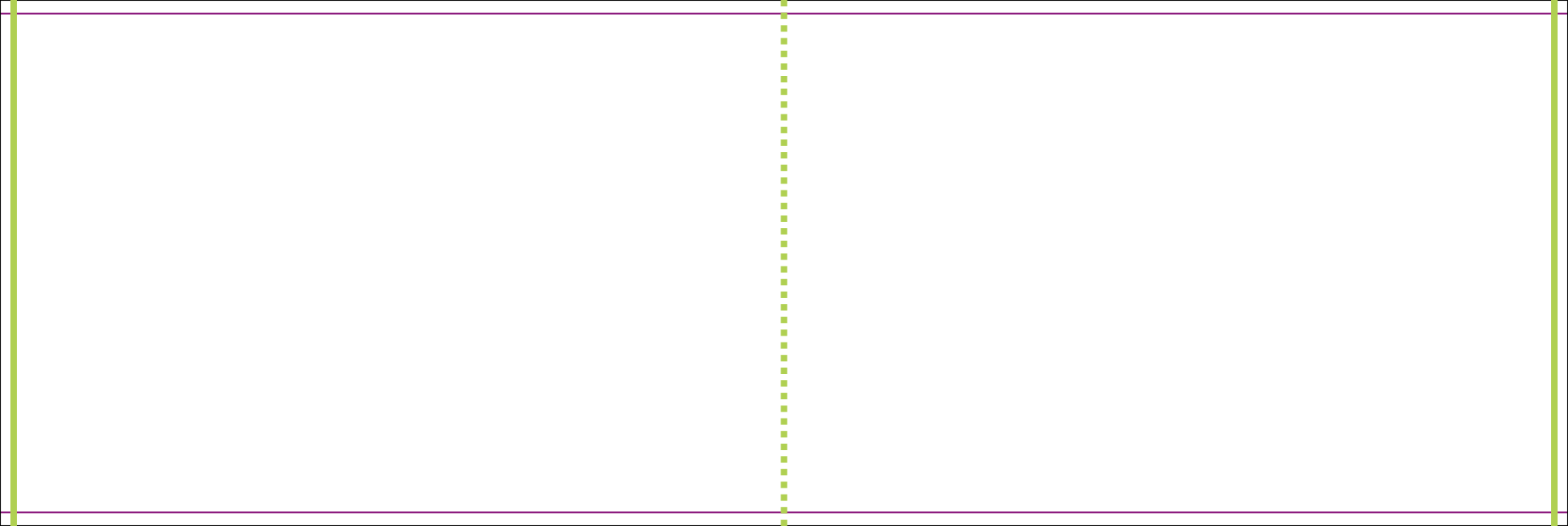
Booklets need more bleed than other products. Look at the finished page size of the Booklet. Add 3mm to all sides of your page – a total of 6mm across each axis. You even need to add bleed to the edge which forms the spine. Our process chops this off and merges the spine together.
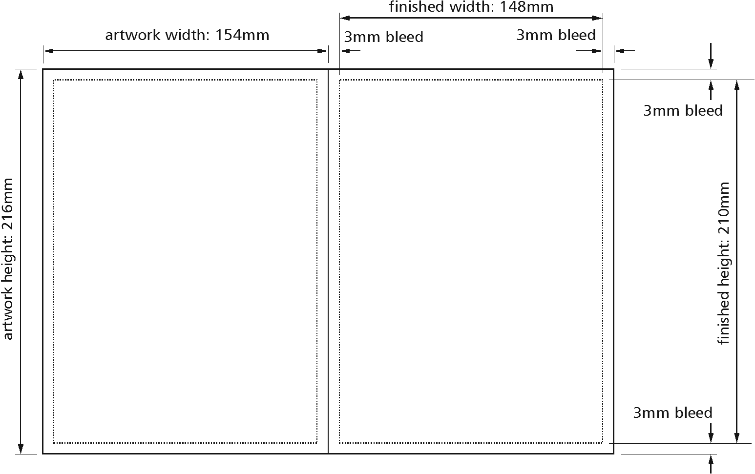
Two pages. Note that they are separate pages, arranged as a spread.
The dotted line shown here (not an artwork item) indicates the finished size of the booklet.
Each template has a specific orientation, either landscape or portrait. Don’t change this.
If you want to supply landscape pages on a portrait booklet, just rotate the content of the pages yourself so they fit in the orientation required by the product specification (For example, the back page should be rotated clockwise and the front page and all other pages rotated anti-clockwise). While doing this, pay careful attention to the imposition. Make a mock-up to be safe.
It’s unlikely that objects which cross pages will line up exactly. It’s best to avoid them or accept that there will be some vertical movement throughout your Booklet. You’ll also need to allow for the bleed being trimmed off – ask us if you’re not sure.
If you must have elements that cross the spine, make sure your artwork follows our guidelines for making it work.
Don’t use borders; they’ll look terrible.
.png)
Avoid trying to match colours throughout the booklet. Some colour variation is inherent in the process and will be most noticeable where two pages of the same colour meet. If you’re ordering a booklet with a thicker cover then it is unlikely that colours crossing from the outer cover to the inner pages will match perfectly due to the different finishes of papers and card types.
In a stapled Booklet the bulk of the paper causes the inner pages to extend (creep) further out than the outer pages when folded.  When trimmed the inner pages are narrower than the outer pages. The amount of creep is dependent on the number of pages and paper thickness. The thicker the Booklet, the more you need to keep important objects away from the edges.
Normally, we recommend that you keep important objects at least 4mm from the ‘trim’ size. As a result of creep, we’d advise you to increase your margin to avoid anything being chopped off – larger quiet areas are definitely better. When we design Booklets ourselves, we tend to leave at least 10mm of ‘Quiet Zone’ or ‘safe space’ on the trimmed edge. This means that creep isn’t as noticeable and items won’t be chopped off. If your booklet is thicker than 20 pages, we recommend adding 1mm to the quiet zone for each extra 8 pages.
If you are designing a booklet with a folder for a cover, please call us to discuss this as we can give you a special template and specific advice on setting the files up ready for us to produce.
Are you producing your booklet from our Digital Range? If so please read the extra information on our How To supply files for our digital range, as the process for those is different.
Download the appropriate InDesign template to start your design from.
Standard Presentation Folders
• Artwork orientation
• Use of colour
• Optional Peel and Stick
• Custom Folders
Custom Folders
• Choose a Product
• Limitations of the forme
• Complexity and anchor points
• More complicated than that?
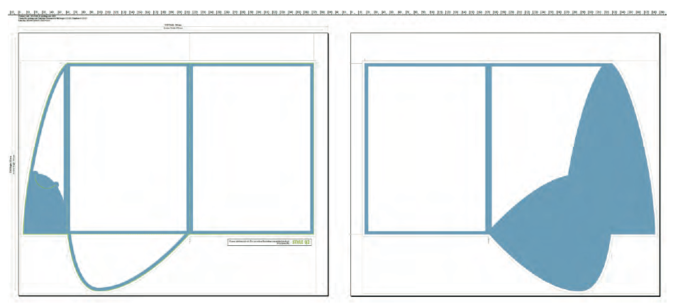
The standard Presentation Folders use a standard guide for cutting. We have templates available that you can use to construct your artwork within that match these fixed guides.
If you're using one of our standard folder styles below, then do not modify the cutting lines provided on the template. The artwork also contains an identification panel, e.g. 'Style P2' - this must not be removed or altered in any way.
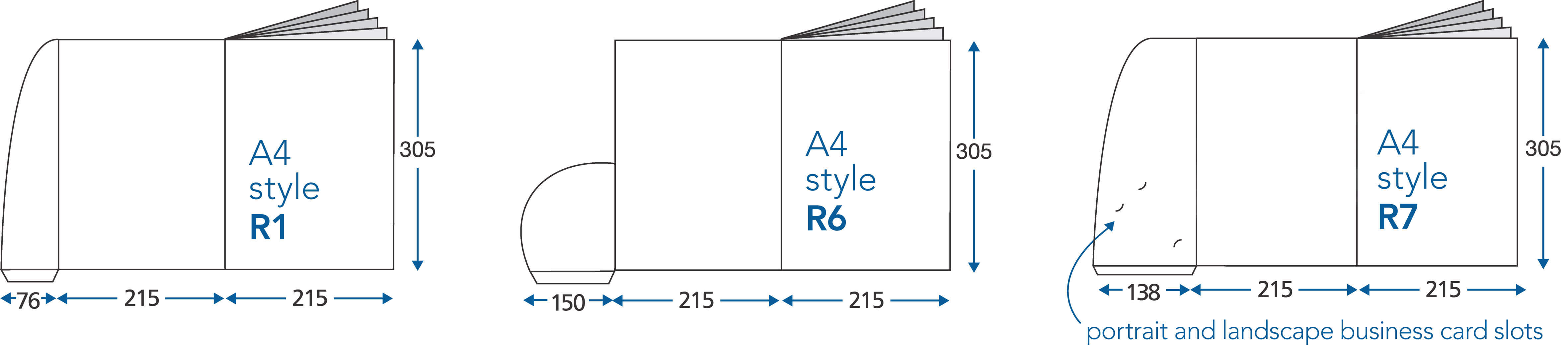
The styles available are:
Soft-touch Folders are available in 3 styles only. They close by interlocking and are supplied flat. Custom style/template is not available on this product.
Interlocking Presentation Folders are available in 12 styles. They close by interlocking (excluding style P1) and are supplied flat.

Peel & Stick Folders are available in 8 styles. They are supplied with Peel & Stick Tape attached and are supplied flat for self assembly.
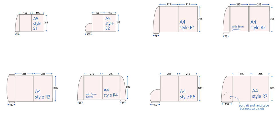
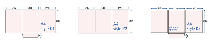
3 Panel Folders are available in 3 styles. Styles K1 and K3 have a flap to hold their contents and are supplied flat.
Booklet Folders are available in 3 styles. They hold 4, 8, 12 or 16 text pages (which are stitched in) and include a glued flap/pocket. The are supplied assembled.


Please see below if you require a Custom Style for any of the above Folders (Please note that Custom Style is not available on Soft-touch and Saver Folders).
Please note that custom formes will not be archived unless requested - ask for details.
Artwork must be supplied‘upright reading,’ i.e. not rotated. The reverse layout must be a mirror image (left to right) of the front layout, as shown below (The blue Quiet Zones show areas hidden by assembly). The cutter guide and template markings are off set on the pages, do not re-centre the artwork.
We'd recommend that you bleed the background of the artwork to the full extent of the template box - this enables better colour consistency across all panels of the folder.
Try to avoid large areas of the same colour or gradients – that’s where colour issues such as banding or ghosting becomes most noticeable. Try to break up large areas of colour with alternate elements or add a background image.
Correct:

Incorrect:

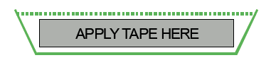 Peel and Stick folders must have the ‘tape strip position indicators’ present at every place requiring a tape strip. Our standard templates already include this.
We can produce custom folder cutter guides. You'll need to use one of these if you need to adjust any of our standard templates in any way.
Simply supply your Cutter Guide on page 3 of your PDF
It is usually quicker and safer to base your custom design on an Existing Folder Template.
Cuts: 2pt stroke (continouous line)
Creases: 2pt stroke (2pt dash, 2pt gap)
Use the smallest product that is big enough to contain your artwork, including bleed.
| Product | Maximum finished size | ||
|---|---|---|---|
| Width | Height | ||
| 2-Panel Folders: Holds A5 | PFA5?X? | 378 mm | 320 mm |
| High Capacity Folder | FFQ4?CU? | 445 mm | 354 mm |
| 2-Panel Folders: Holds A4 | PFA4?X? | 608 mm | 415 mm |
| 3-Panel Folders: Holds A4 | CFA4?X? | 658 mm | 438 mm |
| P8-sized Folder | PFA4?P8? | 702 mm | 320 mm |
| Presidential Folder | PRA4? | 870 mm | 378 mm |
Test your artwork in the template in InDesign, before committing a quote to your customer.
Parallel creases, i.e. on a folder with extra capacity or a gusset, must be at least 5 mm from each other.
For gussets larger than 5 mm, use dimensions rounded to the nearest 1 mm, so 6 mm, 7 mm, 8 mm and so on.
Ensure that creases are no less than 5mm away from a parallel die-cut line.
| Type | Maximum Forme Anchor Points |
|---|---|
| A5 Folders (2-Panel) | 23 |
| A4 Folders (2-Panel) | 30 |
| Media Folders | 30 |
| Corporate Folders (3-Panel) | 30 |
| Presidential Folders | 30 |
If your design exceeds these limits, email a PDF of the forme only for an assessment of additional costs and turnaround (we will endeavour to inform you of any delays in replying), which we will add on your approval.
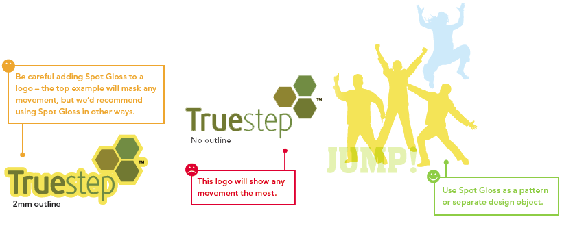
Selected products have an option to add a Spot UV clear varnish shape onto the areas that you mark with a special finishing swatch. This swatch is available in our templates.
Artwork must be supplied containing a layer indicating the areas to be spot UV using the correct colour swatch.
For products with Spot UV on one side, artwork should be supplied on the first file uploaded or the first page of a 2 page PDF. For example: Page/file 1: (front) Artwork containing spot UV & printed design, Page 2: (reverse) Artwork containing printed design.
Artwork supplied incorrectly may lead to delays with sending your order to print.
All of our InDesign templates include specific colour swatches for all finishing options or use the instructions below to set up the 'SPOT-UV' spot colour yourself:
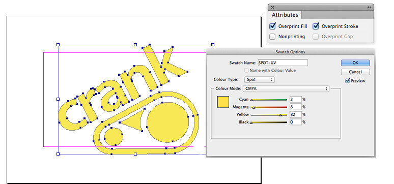
Place Spot-UV elements above your artwork using the special Spot-UV spot colour swatch. This swatch must remain as a spot colour and must not be adjusted in any way. Do not overlay white shapes over the top of the Spot UV elements.
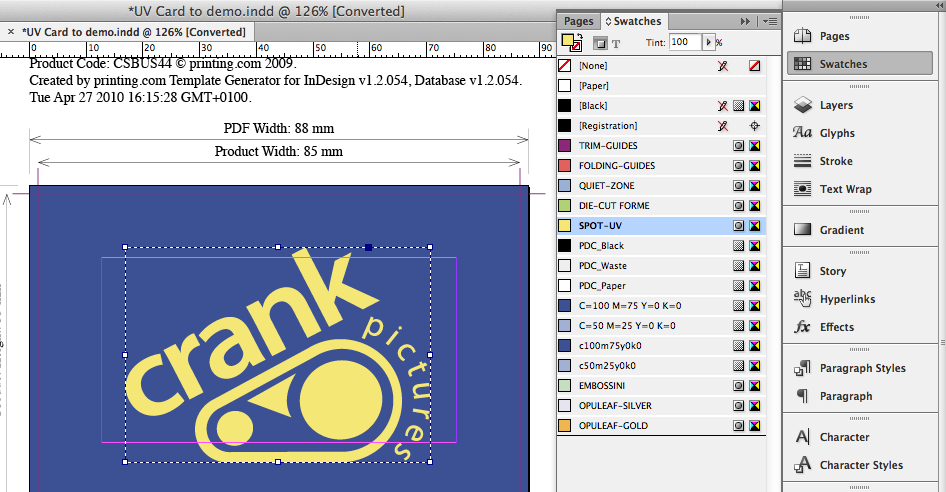
Set the Spot-UV elements to Overprint from within your design application.
Keep creases and cuts at least 2 mm away from Spot-UV elements.
Only use Spot-UV elements on the front pages of your artwork, unless you're making artwork for a double sided Spot UV product.
The UV varnish is applied using a screen printing process, and registration with print can vary by ±2 mm. This means you should expect the Spot UV element to move around the page by up to ±2 mm.
If you are aiming to cover a printed shape having a hard edge, then the Spot UV shape should overlap the printed edge by 2 mm to allow for any inherent variations in registration. Likewise, block shapes meeting the edge should be treated like backgrounds: bleed them to the very edge of the document page, and respect the Quiet Zone.
Spot UV is not suited to alignment with fine detail, such as small type, or shapes with thin lines.
Our rule of thumb:
You’ll get best results when you don’t try to match the Spot UV to printed objects, and instead treat it as a design element in its own right.
Seperate Spot UV elements should have a minimum spacing of 2mm. Placing elements too close to each other will result in them becoming one shape and filling in.
Avoid large solid areas of Spot UV bleeding to the edge as chipping and flaking may occur once the job has been guillotined or die-cut. Any spot UV elements must be a minimum of 3mm from the trimmed edge.
Spot UV elements must be supplied in vector format; any text shapes to be spot-varnished must be converted to paths/outlines.
Remember to:
That includes the counters, stroke width and serifs on fonts.
Spot UV cannot be specified as a gradient or tint, i.e. a changing tint from 100% to 0% over an area of artwork.
We have produced some printed samples that demonstrate how to use Spot UV, ask us for your free copies.
After following the recommendations above check the following:
SPOT-UV artwork in on the topmost layer:
SPOT-UV artwork is set to Overprint:

SPOT-UV Swatch is set up correctly:
 SPOT-UV Swatch shows in Adobe Acrobat's Output Preview:

SPOT-UV colour is transparent when Simulate Overprint is selected in Output Preview:
![]()
SPOT-UV colour is yellow when Simulate Overpint is NOT selected:

SPOT-UV colour is highlighted when Show Overprint is selected:

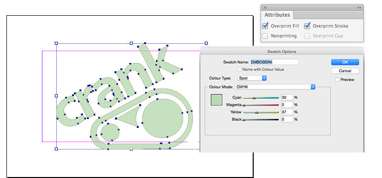
Certain products have an option to add an embossed area to your design. You indicate this by using a special finishing swatch. This swatch is available in our templates, please ask for a copy before starting your design.
All of our InDesign templates include specific colour swatches for all finishing options or use the instructions below to set up the EMBOSSINI spot colour yourself:
Place the Embossing elements above your artwork using the special EMBOSSINI spot colour swatch. This swatch must remain as a spot colour and must not be adjusted in any way.
Set the EMBOSSINI elements to Overprint from within your design application.
Avoid having areas of embossing bleeding to the edge as chipping, flaking and flattening of the embossed area may occur when the job is guillotined.
Only add embossed elements on the front page of your artwork.
This swatch is available in our templates, please ask for a copy before starting your design.
The embossing is applied using by applying pressure from the reverse with a die and stretching the fibres of the paper. This means that the registration with print can vary by ±1 mm. This means you should expect the embossed element to move around the page by up to ±1mm.
If you are aiming to cover a printed shape having a hard edge, then the embossed area should overlap the printed edge by 1 mm to allow for any inherent variations in registration.
Embossing is not suited to alignment with fine detail, such as small type, or shapes with thin lines.
Our rule of thumb:
You’ll get best results when you don’t try to match the embossing to printed objects, and instead treat it as a design element in its own right Seperate embossed elements should have a minimum spacing of 1mm. Placing elements too close to each other will result in them becoming one shape and filling in.
Avoid using embossing on small text. Fine fonts, particularly those with serifs or tapered lines do not produce good results. The thinnest part of the font must be 1mm in width.

Avoid having areas of embossing bleeding to the edge as chipping, flaking and flattening of the embossed area may occur as the job is guillotined.
Embossed elements must be supplied in vector format; any text shapes to be spot-varnished must be converted to paths/outlines.
Remember to:
That includes the counters, stroke width and serifs on fonts.
Embossing cannot be specified as a gradient or tint, i.e. a changing tint from 100% to 0% over an area of artwork.
Embossing depth cannot be accurately measured. It is a process where the finisher determines the depth based on artwork and paper stock, and then has to continually maintain throughout the run. As a rule pressure will be applied to ensure depth will be as deep as possible without cracking the paper. Embossing on printed areas creates more opportunity for cracking and this cracking will be more noticeable on
dark colours.
Printed samples are available, demonstrating how to use embossing. Ask us for your free copies!
Certain products have an option to add a foil blocked area to your design. You indicate this by using a special finishing swatch. This swatch is available in our templates, please ask for a copy before starting your design.
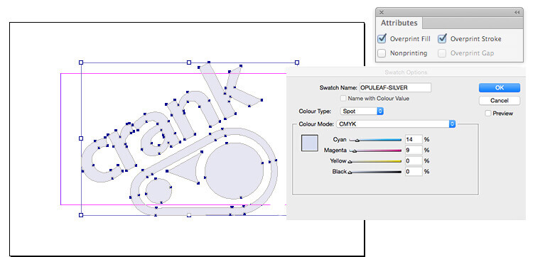
All of our InDesign templates include specific colour swatches for all finishing options or use the instructions below to set up the OPULEAF-GOLD, OPULEAF-SILVER and OPULEAF-COPPER spot colours yourself:


Place the Foil Blocking elements above your using one of the special Foil Blocking spot colour swatches.
There are 2 swatches available:
You can only use one or the other, not both
These swatches must remain as a spot colours and must not be adjusted in any way.
Set the OPULEAF-GOLD or OPULEAF-SILVER elements to Overprint from within your design application.
Avoid having areas of Foil Blocking bleeding to the edge as chipping and flaking of the foiled area may occur once the job has been guillotined.
Only add Foil Blocked elements on the front page of your artwork.
Foil stamping or blocking is a process where a solid area of the paper has a silver or gold metallic foil applied by heat and pressure This means that the registration with print can vary by ±1 mm. This means you should expect the Foiled element to move around the page by up to ±1mm.
If you are aiming to cover a printed shape having a hard edge, then the Foiled area should overlap the printed edge by 1 mm to allow for any inherent variations in registration.
Foiling is not suited to alignment with fine detail, such as small type, or shapes with thin lines.
Our rule of thumb:
You’ll get best results when you don’t try to match the Foiling to printed objects, and instead treat it as a design element in its own right. Seperate Foiled elements should have a minimum spacing of 1mm. Placing elements too close to each other will result in them becoming one shape and filling in.
Avoid using Foiling on small text. Fine fonts, particularly those with Serifs or tapered lines do not produce good results. The thinnest part of the font must be 1mm in width.

Avoid having areas of Foiling bleeding to the edge as chipping and flaking of the Foiling area may occur once the job has been guillotined.
Foil Blocked elements must be supplied in vector format; any text shapes to be spot-varnished must be converted to paths/outlines.
Remember to:
That includes the counters, stroke width and serifs on fonts.
Foiling cannot be specified as a gradient or tint, i.e. a changing tint from 100% to 0% over an area of artwork.
The process of foiling leaves a faint cross hatch effect on the reverse of the product where foiling is applied on the front. Foil residue can also be present on the edges of foiled areas. This is inherent in the foiling process.
We have produced some printed samples that demonstrate how to use Foil blocking, ask us for your free copies.
Download the appropriate InDesign Template to start your design from.
Artwork for Folded Leaflets is the same as regular flat products. The artwork is to be designed 'flat', showing more than one panel per designed page, with essential elements avoiding the folds and edges. You don't need to supply us folding guides for our standard folds - please contact us if you are designing a file that needs custom folding.
Download one of our Folded Leaflet InDesign Templates to base your design on. The fold marks and quiet zones provided in the design templates are to help with design, and do not appear on printable artwork.
The outside design should be supplied as page 1 and the inside design as page 2. You can supply two seperate PDF files or 1 PDF with 2 pages.
PDF Page 1 (Outside) PDF Page 2 (Inside)
End Panel, Back Panel, Front Panel Inside Left, Middle, Inside Right
Example of an A4 Folded Leaflet (A4 Roll-Folded to DL)

If you require an Approved Custom Fold from the list below please contact us. Custom Folds carry an additional cost and add 1 working day to your order.
• A2 to A5 - A2 concertina folded to 148x420mm, then half folded to A5.
• A3 to DL - A3 half folded to A4, then roll or Z folded to DL.
• A3 to A5 - A3 landscape half folded to 420x148mm, then half folded to A5 landscape.
• A3 to A6 - 4 panel concertina fold, then half folded to A6.
• A4 to A7 - 4 panel concertina fold, then half folded to A7.
• A4 to 99x105mm - 3 panel roll or concertina fold, then half folded to 99x105mm
• A4 half folded to A5 and half folded again to 74mm x210mm
Please supply your files using a 1.5mm bleed. We do not require Crop/Trim Marks or Folding Guides to be present on your artwork, just email us the panel dimensions your require, with the measurements taken from left to right for page 1 only.
For example:
Custom size = 287 x 210mm (290 x 213mm including 1.5mm bleed)
Finished Panel Dimensions = 89mm (End Panel) / 99mm (Middle Panel) / 99mm (Front Panel).
A mistake commonly made with Folded Leaflets is to design incorrectly sized panels for the product’s fold type, resulting in the product looking unusual, e.g. short front panels, panels missing their folding line, front-to-back misalignment, and even mixed-up panels. Please ask us for a template to avoid fold alignment issues.
Respect the Quiet Zones by keeping text at least 4mm away from the folds – these Quiet Zones are identified on the Quiet Zone layer of the templates.
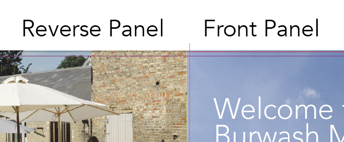 We recommend that ‘Front cover panel’ backgrounds should overlap the fold. When designing Folded Leaflets with a front panel background that is close to the fold, ensure that the picture overlaps the fold by 1 mm. This allows for production tolerances when folding, and prevents a contrasting stripe (from the adjacent reverse panel) from showing on the front face of the finished Folded Leaflet.
When paper is folded, its interlinking fibres are compressed on one side and stretched on the other. If the outer fibres lose their hold on each other, we see this as 'cracking': an opening out of the paper on the outside. This will be more visually apparent where the design includes a dark colour across the fold. If dark colours are required please upgrade to a Laminated Product which will help to reduce the appearance of cracking. (This also affects Folded Flyers which go through the same process)
To indicate your intended front panel to us, just add a 0.25pt red keyline around the outer three edges of your front cover. This won't be visible once your folded leaflet has been printed.
We'd recommned that you produce a working mock-up of the design yourself (there is no requirement for this to be sent to us though). This often gives an indication of what makes a well-balanced layout, and might also catch layout errors.
Some Folded Leaflets can have a perforated easy tear-off panel, the sizes available are: A3, A4, A5, 2 panel DL, 3 panel A5, 3 panel A6, 4 panel A6, and 4 panel DL. Advice on artwork and file supply is the same as Folded Leaflets above.
There are 3 options for the position of the perforation;
The template below for a 3 panel fold has the front panel as the tear-off panel, indicated by a 0.5pt green dashed line on the page edge.

We have templates available that are specific to Perforated Folded Leaflets, please ask us for a copy.
Perforated Leaflets are the same as our range of 150gsm Gloss and 170gsm Silk flat Leaflets, but with an added perforation.To indicate your choice of perforation, please add a 0.5pt green dashed line to the page edge.
There are 2 fixed half perforation options available:
.png)
The ‘Half Perf’ options will always be dead centre of the short or long edge. This example on the right shows the green dashed line on the right short side of the page, this will have a perforation applied to the centre of the page parallel to the short edge of the page.
The 1/3rd Perforation is always made parallel to the short edge and is available on A3, A4 and A5. The position of the perforation for each size is:
Please ask us if you want a different position for your perforation.
There are a few elements that you should consider that are specifically related to our digital printing process. Follow this advice to ensure you get the best possible printed results:
Avoid using colours with a total ink limit over 275%. Any colours exceeding this will be automatically re-mapped to their nearest equivalent so there may be a shift in colour.
Where digitally printed items are concerned, bigger IS definitely better – we recommend at least 10mm. Having important elements such as text less than 10mm from the edge may be printed with unexpected results.
Where possible, keep the design simple, lots of white space tends to work well. Large areas of flat colour can be problematic, resulting in an uneven solid that can look banded. A large area is defined as larger than 40mm square.
To achieve neutral shades of grey use black only. It is best to avoid using grey tints below 20% or over 80%. Large areas of grey can appear patchy and uneven - consider adding a texture to help mask this. Greys that are made up of all four CMYK printing channels have a tendency to print unevenly with a yellow cast to them.
Gradients don’t print well, If you must use them, try adding texture or a low amount of noise to ensure a smoother transition from light to dark. Alternatively, limit blends to less than a 50% tint change. Grey tints are less forgiving than other colours. You’ll get better results if you create your blends in a raster based application such as Photoshop®.
Consider adding texture to any large areas of colour, especially on lighter tints. Avoid using tints below 10% as these are likely to disappear when printed.
If you are designing a booklet to be used on a Thin White Border product then you do not have to add the white border yourself. We will add the border automatically for you. The border that we add
will vary in size depending on the thickness of the booklet. If you do wish to add your own thin white borders then ensure that this is at least 10mm wide.
 When designing your digital booklet you need to allow for creep. Bear in mind that with the Thin White Border products, the thickness of the border will vary throughout the booklet due to the creep being trimmed off.
If you are designing any of our precut digital sticker sheets then please ask for a template. If you are supplying us with one copy of the design for us to duplicate then please ask us for the dimensions.
Our Digital Folders are cut and shaped before they are printed on our digital equipment. That means that you don't need to supply us with a cutter guide.
We have a template available for you to design within, please ask for a copy. The template contains guides on the Finishing Layer to indicate the cut and scored elements of the Folders to help you layout your design.

There is a 10mm non-printable area around each panel, which results in a thin white border on each panel, illustrated above. The white frames are the non-printable areas, artwork must not enter these areas.
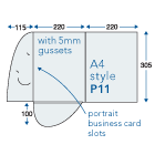
There are quiet zones around the interlocking flaps and and business card slots (shown above), we recommend that artwork stays clear of these zones.
Download an appropriate InDesign Template to start your design from.
The method used for producing the scratch panels is not a high-security process and thus is not recommended for prizes of high value. The best type of prizes are ones that are low value to you, but high perceived value to the end user.
Scratch Cards are available with a latex panel applied to a shape of your choice. We use the DIE-CUT FORME colour swatch in our templates to indicate the scratch off latex area in your artwork.

Each variation may be designed to be a ‘winning’ or ‘losing’ card.
For Scratch Cards with multiple variations (250 x prize one, 1,000 x prize two), please add one set of the required quantity to the Basket, skip the file upload step, then select the Duplicate icon next to the product title to create additional variations of the same product (you can change the quantity for each item in your Basket before proceeding to checkout).
Text or symbols for the game or prizes under the latex panel should be included on the artwork on the same layer as main artwork for the card.
To avoid the end-customer seeing through the latex, we recommend that the artwork under a scratch panel is set to up as follows:
• The background should be 20% black.
• Graphics should use only tints of black, between 30% and 50%.
• Text should only use a black 50% tint.
WARNING: Any deviation from the above specification may produce unexpected results and your artwork may be visible through the latex.
Make sure your artwork under the scratch panel has suitable contrast – i.e. don’t use 8 pt type in 30% black and expect it to be visible!
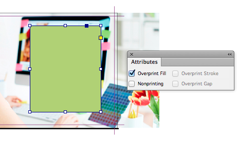
The latex panel needs to be supplied as a shape above your artwork filled with the special DIE-CUT FORME spot colour swatch. This swatch must remain as a spot colour and must not be adjusted in any way.
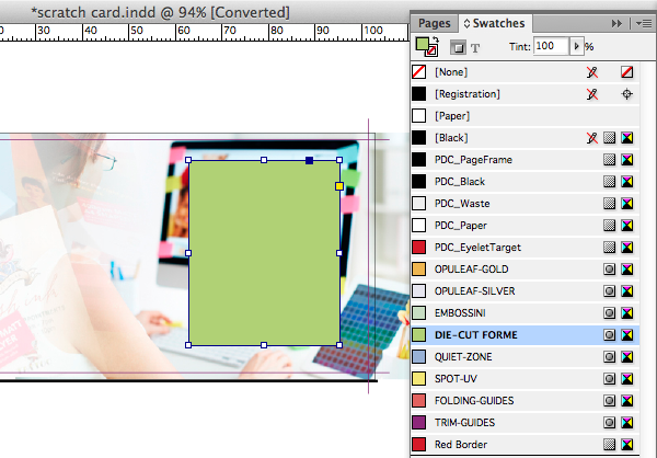
Set the DIE-CUT FORME elements to Overprint from within your design application.
Bleed the DIE-CUT FORME shape at least 1mm beyond the edge of the game panel that is to be behind the latex panel.
The latex is applied using a screen printing process, and registration with print can vary by ±2 mm. This means you should expect the panel element to move around the page by up to ±2 mm.
The latex panel should not be bled off the edge of the artwork, scratch panels are recommended to not encroach into the quiet zone.
 Keep the panel shape simple
Simple shapes are allowed for the scratch panels. These include squares, rectangles, circles and diamonds.
Avoid:
Avoid bleeding to the edge as chipping and flaking may occur once the job has been guillotined.
Latex must be supplied in vector format.
You may position any number of scratch panels anywhere on the front of the design with a minimum space of 4mm between each.
The smallest shape recommended is 10 mm square. Anything smaller is produced at your risk as the process becomes unpredictable.
The reverse of a Scratch Card can use CMYK but the maximum recommended level is 225%. For large areas of colour over 20mm square we would advise to keep the ink below 150% if possible.
As the reverse is uncoated and highly absorbent uncoated paper, which can be prone to set-off when large blocks of solids are used.
For the best results we recommend avoiding:
In addition, the heat of the lamination process can cause such areas to become tacky and attach themselves to the glossy front of the sheet beneath it in the pile.
Download our Digital Sticker Templates.
Take a look at our general guidelines for Supplying Digital artwork.
These are designed as sheets containing a grid of stickers. The area is yours to use, so you may place a different variation in each shape, or make them all identical.
Digital Stickers are delivered as A4 sticker sheets and the number of stickers per sheet depends on your chosen style.
We print the stickers on SRA3 sheets and then cut them in half prior to despatch.
The prices and quantities we display are for sheets of stickers. So if you choose a quantity of 20 for 37 mm Circles, then you will be ordering 700 stickers, as 20 × (A4 sheets having 35 stickers each).
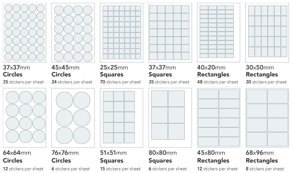
View and compare all the options in the Digital Stickers product group:
| Product code | Product name | Printed |
|
FFKSC10 |
Digital Sticker Sheets: Circles 37mm | 35 per A4 sheet |
| FFKC45 | Digital Sticker Sheets: Circles 45mm | 24 per A4 sheet |
| FFKS2525 | Digital Sticker Sheets: Squares 25x25mm | 70 per A4 sheet |
|
FFKS3737 |
Digital Sticker Sheets: Squares 37x37mm |
35 per A4 sheet |
|
FFKR2040 |
Digital Sticker Sheets: Rectangles 20x40mm | 48 per A4 sheet |
|
FFKR3050 |
Digital Sticker Sheets: Rectangles 30x50mm | 30 per A4 sheet |
| FFKC64 | Digital Sticker Sheets: Circles 64mm | 12 per A4 sheet |
| FFKLC10 | Digital Sticker Sheets: Circles 76mm | 6 per A4 sheet |
| FFKS5151 | Digital Sticker Sheets: Squares 51x51mm | 15 per A4 sheet |
| FFKS8080 | Digital Sticker Sheets: Squares 80x80mm | 6 per A4 sheet |
| FFKSR10 | Digital Sticker Sheets: Rectangles 45x80mm | 12 per A4 sheet |
| FFKLR10 | Digital Sticker Sheets: Rectangles 68x96mm | 8 per A4 sheet |
Do not remove anything from (nor move anything on) the Finishing layer.
We have provided (invisible!) boxes on the Background layer, which you should use to contain your sticker backgrounds. If you have a uniform background, then it might be easier for you to use the larger box that encloses all shapes (also on the Background layer).
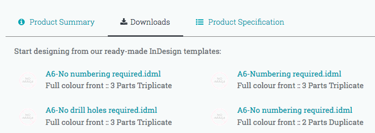
Download a template for your design for the 'Downloads' tab on the Digital Full Colour NCR product pages.
Digital Full Colour NCR Pad Templates
Digital Full Colour NCR Set Templates
Sets are available in individual sets of 2 or 3 parts.
Paper sequence is only available in:
All parts are printed with the same artwork.
You can choose any edge to be glued.
To indicate which edge is to be glued, apply a 0.25 pt red line (process colour: 100M, 100Y) to the desired page edge over the normal black 0.25 pt border. This red line must not be set to overprint.
By default the template will have a red line at the top edge. This must be changed to your desired gluing edge.

The numbering is printed as variable data, which means you can specify any colour in CMYK, and any size in one position only.
Starting number must be on the PDF in the exact colour, size and font. This number must be set to overprint. Do not convert the number to outlines.
Centre radius may be between 10 mm and 65 mm from an adjacent straight edge.
If you need to have a hole drilled less than 10 mm from a straight edge, you may do so only if the position is 10–65 mm from another adjacent edge.
On the artwork, place a cross + of diameter 2 mm to indicate the drilling position, line thickness 0.5 pt, and of a colour that contrasts with the background.
Leave a clear zone of 5mm around each hole.
Avoid designing with large areas of solid ink, a large area is defined as an area larger than 50 x 100mm.
If you are just using black, leave as 100% Black.
Tinted areas to be written on with more than 8% tint/shade value of colour may cause carbon transfer problems on duplicate copies. Keep tint/shaded areas between 5-8%.
Maximum recommended total ink level is 225%.
i.e. terms/conditions etc, it is advised to tint/shade content to a maximum of 60% which reduces show-through on the front of document.
Pantone + Solid Uncoated
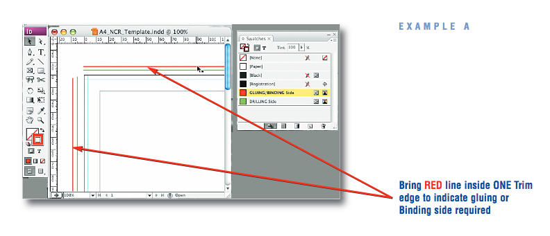
Indicating Gluing/Binding Edge
In all the spot colour NCR templates there is a RED overprinted line for you to use to indicate which side of the artwork you want to be glued/bound. Place the red line just inside the page edge as per the example below.
Specifying Optional Drill Holes

Download the appropriate InDesign template to start your design from.
When supplying your files it's important to supply the first page of your PDF as the front/outside. This is the side we apply our Gloss Lamination to. Matt Lamination is applied to both sides as standard on our 400gsm stocks.
Our Spot UV, Foil and Windowed/Shaped cards are also supplied with the finish on page one of your PDF.
When designing greetings cards with a front panel background that should touch the fold, ensure that the picture overlaps the fold by 1mm.

This allows for production tolerances when creasing, and prevents a contrasting stripe (from the adjacent panel) showing on the front face of the finished card. Remember to manage your customer’s expectations that there may be part of the front design just visible on the back.
Folding products on heavy board (e.g. greetings cards, folding business cards, etc.) now contain die-cut lines to form the two cuts parallel to the centre crease. This should help the edges to meet up correctly when folded. Do not remove these lines.
When viewed flat, the inside artwork needs to read upside-down relative to the front.
Our Windowed Christmas Cards allow for a simple cut-out shape on the front panel.

Please see Die Cuts for more information.
If you are printing partial coverage, with clear unprinted areas then you will usually need to add a White_ink layer to print behind any printed areas.
If you do not add this, the printed areas will appear lighter and slightly transparent a bit like a stained glass window.
All of our InDesign templates include specific colour swatches for all finishing options or use the instructions below to set up the 'White_Ink' spot colour yourself:
.png)
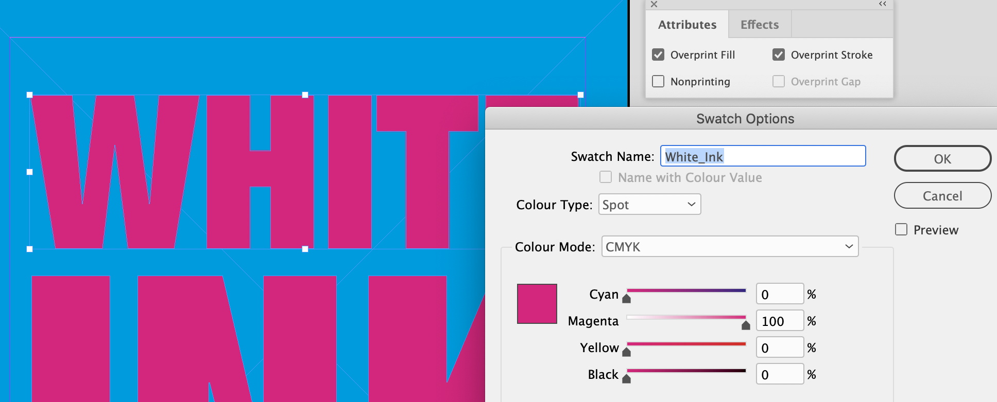
Place White_Ink elements above your artwork (e.g. on the Finishing Layer or brought to front on the top-most Artwork Layer) using the special White_Ink spot colour swatch. This swatch must remain as a spot colour and must not be adjusted in any way.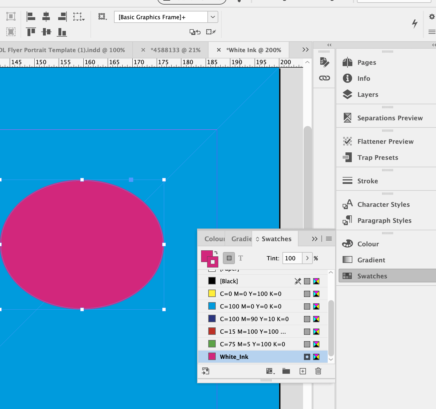
Set the White_Ink elements to Overprint from within your design application.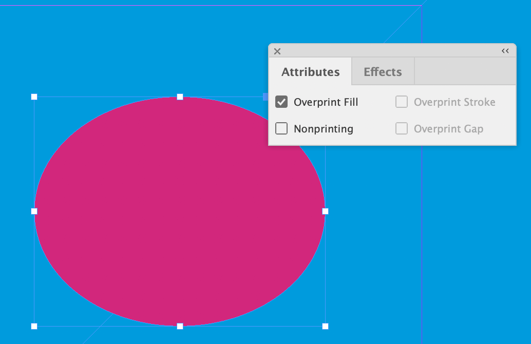
If your product is square cut follow the guidelines below. If you are ordering a shaped large format product, please refer to How to supply files for Shaped Large Format products.
Designing Large Format Posters is slightly different to designing for litho print, partly because of their increased size but also because of the difference in technology.
Ideally you should position images and text at least 10mm from the edge of the Poster. For best results, make your background bleed fully to the edge of your artwork if it is within 10mm of the edge.

Large Format Posters are designed to be viewed at a distance (usually of at least 1m). This means that images don’t need to be as high  resolution as on litho printed items. We recommend that the images inside your PDF for Large Format Posters are set at a maximum of 150dpi. Any higher won’t make any difference to final print, but will take much longer to process, and may delay the processing of your job.
To create a good solid black, use rich black (100% K with 40% C). Don’t use four-colour black and try to keep all elements under 225% total ink limit. It’s best to avoid solid colours of only one ink (i.e. pure cyan, magenta, yellow or black) as these can be susceptible to slight “banding”. Also, any greyscale images should be converted to CMYK prior to being printed on our large format equipment.
Due to the different technology used to produce our Large Format range, and the limitations of the substrates, it’s unlikely that colours will match our range of litho printed products.
 We’d recommend that you keep your text to a minimum of 14pt. Use a vector-based application like Adobe InDesign® or Illustrator® to set your text, rather than creating it in a bitmap-based application such as Photoshop. It is best to convert all text to outlines for large format printing.
When designing a Pop-up Banner, remember that there will be an area at the bottom of the poster where the poster has to wrap around the spindle in the stand, this area won’t be visible so we’d recommend not putting important elements within 200mm of the bottom of your design (you’re fine to bleed colour and images to the bottom though).
Outdoor Banners are designed to be viewed from a distance so bold graphics and colours work best, try to avoid small text as it won’t be legible. If your banner is to be supplied with eyelets punched in, you’ll need to allow space on your design for this. Please ask us for a template as this will illustrate where the eyelets are to be positioned (don’t delete the cross hairs though, we’ll use those in our production process).
Ceiling tiles are ordered in batches of 10, so you can have 10 tiles all the same, or you can have 10 different tiles. If you need 20 different tiles you need to set up 2 jobs each containing 10 different PDFs.
 On Canvas Prints, the canvas fabric has to be tensioned around a wooden frame. This means that extra bleed is required on all four edges. We can supply you with a template to work from, just ask. On the templates, the product size is the area that will be visible of the front of the canvas. Anything within the large quiet zone indicated will disappear from view once the canvas is mounted.
Framed Canvas PDF files need to be supplied with the dashed red 2pt keyline which is present in the template, this will appear on the reverse of the frame once the canvas is finished. If you are using images in your design, please don’t embed any colour profiling as this will affect how your print will look, just send us your PDF in CMYK format.
Edinburgh / Budget / Blurb Roller Banner Stand
Vienna / Formal Roller Banner Stand
Your page size including our 3mm bleed should be 806 x 2206 mm for the Budget/Blurb Roller Banner Stand and 856 x 2156 mm for the Vienna/Formal Roller Banner Stand.
We'll trim 3mm off each edge giving you a finished poster size of 800 x 2150 mm or 850 x 2150 mm depending on the product chosen.
Our Budget/Blurb Roller Banner Stands have a 200mm quiet zone and our Vienna/Formal Roller Banner Stands have a 158mm quiet zone, where the bottom of the poster will be hidden in the dispensing roller. Although you should not put any important design elements within this quiet zone, you should bleed your background fully into this area.

A document height of 2150 mm gives a variable visible height of 1430-1970 mm for the Vienna/Formal Banner Stand and a fixed visible area of 1950mm for the Budget/Blurb Banner Stand.
The templates for these show the extended bottom quiet zone, just turn the layer visibility on to check that you don't have anything that will be hidden when the stand is assembled.
Ensure your PDF includes the Finishing layer which holds the black 2 pt outline to enable correct trimming. No other guides should be present on your PDF.
Files should be supplied at 100% scale, i.e., the correct size.
All posters must have a black 2 pt outline on the edge of the artwork, to enable correct trimming.
Respect the ‘quiet zone’ of 10 mm; position images and text at least 10 mm from the edge of the poster. Make your background bleed fully to the edge of the artwork if it is closer than 10 mm to the edge.
All files for posters must be supplied at 150 dpi. Scanning at a higher resolution is unnecessary, as it will make little difference to the final print. Graphic files supplied at over 150 dpi may be rejected. Higher resolution means bigger file sizes, longer processing times, and will hold up your job.
To produce colour-neutral black, greyscale images intended for Large Format output should be converted to a four-channel CMYK format.
Files with transparencies must be flattened correctly by your design application - see the application-specific file check guides for the recommended settings
Avoid 1-bit images, or 8-bit images that are colourised in a design application. These are fine for Litho printing but might produce unpredictable results in Large Format.
We recommend converting text to outlines on large text elements.
Large Format posters are designed to be viewed at a distance, (usually of at least 1 metre).
This means that images supplied or Large Format products do not need the high resolution required for litho printed items. We recommend that you provide images for Large Format Posters at a maximum of 150 dpi.
The reproduction of any image will not exactly match a litho print of the same image.
All products should be handled with care. Minor scratching and creasing can occur during production. Please remember that these products are intended for viewing at a distance; these minor scratches and creases are not visible at these distances.
Unless otherwise stated in the specification of the product, all poster substrates are recommended for short term use (less than 3 months). All inks fade with time, depending on the ambient environment that they are displayed in. We cannot put an exact time on this due to the variables.
To create a good solid black, use rich black (see page Error: Reference source not found). Do not use four-colour black. Ink limits for Large Format are the same as for uncoated litho printed products (225% maximum recommended).
To produce colour-neutral black, greyscale images intended for Large Format output should be converted to a four-channel CMYK format.
When ordering posters with a lot of images or solids at the top and/or bottom with a lot of white space in the middle, there is a probability that the poster can curl at the top and bottom due to the inks altering the tension of the substrate.
Small text can become illegible at larger distances. We recommend that you keep your text size to a minimum of 14pt. Overlay your text in a vector-based artwork application like InDesign or Quark XPress, rather than a bitmap-based photo-editing application like Photoshop.
Download the appropriate InDesign Template to start your design from.
As the canvas fabric has to be tensioned around a wooden frame, extra bleed is required. On the template, the product size is the area that will be visible of the front of the canvas. Anything within the large quiet zone will disappear from view once the canvas is mounted.
| Bleed, mm | |
|---|---|
| Premium Framed Canvas | 53 mm |
| Budget Framed Canvas | 50 mm |
Framed Canvas files must be supplied with the dashed red 2pt keyline which will appear on the reverse of the frame once the canvas is finished, but the quiet zone markings must not appear on the submitted PDF. If the quiet zone is present on the submitted graphic file then it will be printed.
On our templates the area within the purple guides is the front of the canvas, the area outside is the side and part of the canvas that will stretch behind the frame.
We recommend placing a generous white border around the image if you're unable to bleed the image to the document edge

The alternative is to bleed the image to the edge so that the image appears on the front and sides of the canvas once printed.

Ink limits for canvas prints are recommended not to exceed 225% total area coverage. Please do not embed any colour profiles as this may affect the colours in your file when it is printed.
Large Format posters are designed to be viewed at a distance, (usually of at least 1 metre).
This means that images supplied or Large Format products do not need the high resolution required for litho printed items. We recommend that you provide images for Large Format Posters at a maximum of 150 dpi.
The reproduction of any image will not exactly match a litho print of the same image.
All products should be handled with care. Minor scratching and creasing can occur during production. Please remember that these products are intended for viewing at a distance; these minor scratches and creases are not visible at these distances.
Posters should be supplied at ‘artwork size’. No bleed should be applied. Always supply one file per panel, not one multi-page PDF. The templates for Evolution Pop-up stands still have a page frame, do not delete this but bear in mind that you will loose around 1mm from each edge of the poster when the page frame is trimmed off. This is because the keyline covers your artwork and needs to be trimmed off.
Unless otherwise stated in the specification of the product, all poster substrates are recommended for short term use (less than 3 months). All inks fade with time, depending on the ambient environment that they are displayed in. We cannot put an exact time on this due to the variables.
To create a good solid black, use rich black (see page Error: Reference source not found). Do not use four-colour black. Ink limits for Large Format are the same as for uncoated litho printed products (225% maximum recommended).
To produce a colour-neutral black, greyscale images intended for Large Format output should be converted to a four-channel CMYK format.
When ordering posters with a lot of image or solids at the top and/or bottom with a lot of white space in the middle, there is a probability that the poster can curl at the top and bottom due to the inks altering the tension of the substrate.
Small text can become illegible at larger distances. We recommend that you keep your text size to a minimum of 14pt. Overlay your text in a vector-based artwork application like InDesign or Quark XPress, rather than a bitmap-based photo-editing application like Photoshop.
Fabric Templates
Generic Fabric Artwork Guidelines
QuietZones & Bleed
How to supply Fabric Banner Stands
How to supply a Media fabric display stand
How to supply backdrop Fabric Display Stands
How to supply Custom Sized Fabric
Download the appropriate InDesign templates to start your design from.
Artwork should be supplied at 100% size and should adhere to the following guidelines:
DO NOT try to colour match vector colours to rasterised colours on artwork elements. The rip treats these differently and there will be a visible difference in the final print.
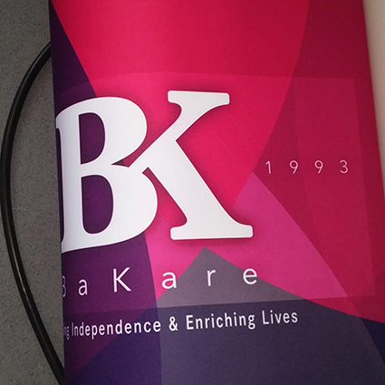
Here is an example of how they may look, the 'BK' logo had a drop shadow applied in a vector application resulting in the colour behind the logo being lighter:
Place the vector and bitmap artwork combined into Photoshop instead to create one bitmap image. You can have vector text and elements, just don't try to colour match them to a bitmap.
This includes vector elements containing opacity changes, transparency effects and vector gradients. Layered psd files also need to be flattened.
Respect the Quiet Zones (blue shaded area below). Fabric stretches and shrinks (different amounts in different directions) during the production process so there is less accuracy compared to paper.
The templates may appear unusually large or proportioned. This is to allow for the stretch/shrinkage of the material. For best results, keep all important elements such as text and logos well within the quiet zone areas but bleed background images/colours to the page edge. Do not try to match up designs from the front to the reverse.
The trim guide on the template shows roughly where the fabric will be cut. Please bleed your artwork to the page edge.
Finishing Fabric Displays is a manual process of cutting and stitching, therefore additional bleed is required. For raw fabric add 50mm bleed to each edge of the finished size you require.
(1).jpg)
The base of all Fabric banner stands are integrated into frame shape. The curvature of the base on each stand is different. These guidelines indicate which parts of the design will be visible or not.
| Product code | Product Name |
| FDSKES? | Totem Pop up Stand - 2.3m |
| FDSLDN? | Python Pop up Stand - 2.3m |
| FDSWIN? | Baby Python Pop up Stand - 1.9m |
| FDSDUB? | King Python Pop up Stand - 3.5m |
Fabric File Supply
Using InDesign TGI Templates for Fabric
The Quiet Zone Guide should not be present on the "Print Ready PDF".

Artwork sitting behind the quiet zone at the bottom sits beneath the frame.

Shows the approximate hemmed and stitched visible area of the finished item. This layer also indicates any folds or bends of the hardware that affect the visible area of the finished product.
The Visible Area/Trim Guide should not be present on your "Print Ready PDF".

Contains a 2pt keyline page frame and a red or blue guide line on one edge to assist with our cutting template and to indicate the front and reverse file.
This layer must be present on your PDF.


This article provides guidance on supplying artwork for the backdrop fabric displays.
| Product code | Product Name |
| FDSCHI? | Stage18 Straight Backdrop |
| FDSNYC? | Stage30 Straight Backdrop |
| FDSSAN? | Stage46 Straight Backdrop |
| FDSHAM? | Rialto Connecting Bridge |
| Product code | Product Name |
| FDSBLN? | Curve24 Curved Backdrop |
| FDSROM? | Curve30 Curved Backdrop |
|
FDSDUR? |
Curve50 Curved Backdrop |
| FDSMAL? | Crest40 Curved Backdrop |
Fabric File Supply
Using InDesign TGI Templates for Fabric
Your regular artwork layer, where you place your design.
Please fill the entire page with your design.

The Quiet Zone Guide should not appear on the "Print Ready PDF".

Shows the approximate hem/stitch/trim area.
The Visible Area layer should not appear on the "Print Ready PDF".

May contain a red guide on one edge to assist with our cutting template. This layer must be present on your PDF.

Due to pdf size limits, the template will be supplied at 50% scale. Your final pdf must be sent at the template size, your artwork will be rescaled at the printing stage.
You should factor this in when positioning and spacing elements. Particular consideration should be given for image resolution as the resolution will drop accordingly when scaled up.
The Bridge is an optional extra that can be attached to any of the three Straight Backdrop products.
The template is similar to the Media stand templates as it has a an optional TV Bracket.
With the addition of some extra guidance for positioning provided on the right hand side of the template.


This article provides guidance on supplying artwork for display stands that feature additional attachments for media content. This includes things TV brackets, Literature baskets or tablet holder.
| Product code | Product Name |
| FDSOSL? | Peacock Media Stand |
| FDSPAR? | Kangaroo Literature Stand |
| FDSOSA? | Padium Tablet Stand |
| FDSMIL? | Queen Peacock Stand |
Fabric File Supply
Using InDesign TGI Templates for Fabric
Respect the (Blue) quiet zones. Fabric stretches and shrinks (different amounts in different directions) during the production process so there is less accuracy compared to printing on paper. The templates may appear unusually large or proportioned. This is to allow for the stretch/shrinkage of the material.
For best results, keep all important elements well within the quiet zone.
The Quiet Zone Guide should not appear on the "Print Ready PDF".

Shows the approximate hem/stitch/trim area.
The Visible Area layer should not appear on the "Print Ready PDF".
.png)
This layer provides an overlay demonstrating the positioning of any media attachments on the stand.
It is not recommended to have important elements behind or aligned to these overlays, due to the inherent variation in positioning of these.
Oslo/Peacock Stand Front

Oslo Stand Reverse
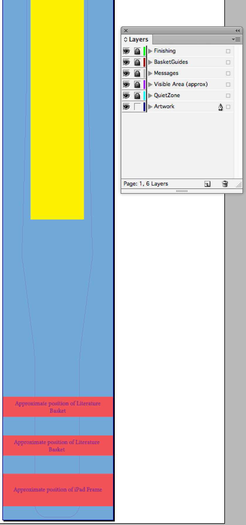
The Basket Guide layer should not appear on the "Print Ready PDF".
Contains a red guide on one edge to assist with our cutting template. This layer must be present on your PDF.

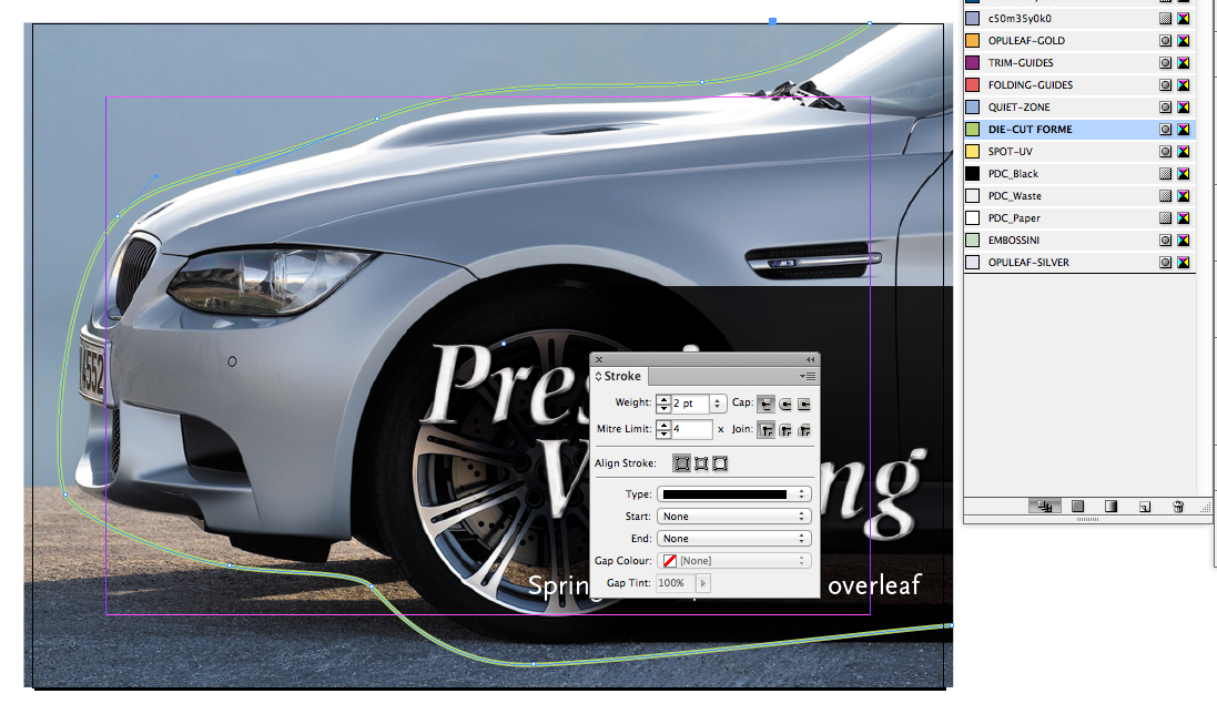
Artwork files for products that are die-cut must be supplied with a layer indicating how and where the item should be die-cut following the guidelines below. Artwork supplied incorrectly will be rejected and may delay your order.
How to supply your cutter guide
How to add a die-cutting guide to your artwork
Setting your die-cut line styles
Limitations: Getting the most from Die Cut products
Forme complexity limits
Push-out Options:
As standard, your job will be supplied with the cut-out shape held within the card skeleton.
One straight side ('Push-out' options)
No straight edges ('Push-out' options
Certain products have an option to add a die cutting guide to achieve a cut shape, perforation, score/crease or punched hole. This guide is supplied to us using a special spot colour swatch. This swatch is available in our templates, please ask for a copy before starting your design.
Download the appropriate InDesign Die-Cut Template to start your design from.
All of our InDesign templates include specific colour swatches for all finishing options or you use the instructions below to set up the 'DIE-CUT FORME' spot colour yourself:
.png)
Place your Die Cut lines above your artwork using the special DIE-CUT FORME spot colour swatch. This swatch must remain as a spot colour and must not be adjusted in any way. The lines must be a 2pt stroke width.
Set the DIE-CUT FORME elements to Overprint from within your design application.
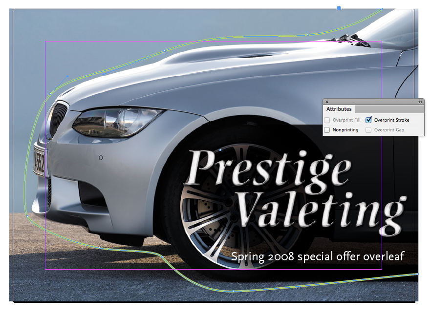
Die cutting is suitable for simple shapes only.
Only place Die Cut lines on the front page of your artwork.
You can specify a cut shape, perforation, score/crease or punched hole. You indicate these using different stroke/line types. The different cut/perforation types are denoted by line style:
| Feature name | Finished appearance | Graphic file specification |
|---|---|---|
| Cut |  Continuous cut |
 Solid line |
| Perforation 3/3 |  3 pt gap, 3 pt cut, … |
 12pt dash, 2pt gap, 2pt dash, 2pt gap, … |
| Perforation 2/10 |
|
|
| Perforation 2/35 |
|
 12pt dash, 4pt gap, 2pt dash, 4pt gap, 2pt dash, 4pt gap, … |
| Perforation 2/70 |
|
|
| Crease | Continuous crease |
 2pt dash, 2pt gap, ... |
| Punched hole | Available as: 2½ mm, and 3 mm – 10 mm in increments of 1 mm. | Fill Colour: DIE-CUT FORME, overprinted. Diameter: 2½ mm – 10 mm. |
Perforation 3/3 is the strongest perforation recommended for Tear-off panels.
Perforation 2/70 is the weakest perforation recommended for Push-Out Shapes on Laminated 400gsm products.
Please contact us to discuss the suitability of perforation you require for your chosen paper stock.
A Die-Cut Crease line style created in InDesign using a 2pt dash and a 2pt gap alongside Stroke Weight and Colour Swatch settings.

To ensure the perforation you require is suitable for the product chosen please get in touch before placing your order.
You can expect the die-cut guide to move by 1mm in either direction.
If your job is going to be die-cut, then it is acceptable to use any combination of cuts, perforations, creases and punched holes, providing that the total number of anchor points does not exceed the maximum allowed for a simple shape, dependent on the flat size of the product.
| Flat size | Anchor point limit | |
|---|---|---|
| Simple | Complex | |
| Smaller than A4 | 15 | 23* |
| A4 or larger | 20 | 28* |
*Complex shapes/formes may be subject to additional costs. Ask us for details before placing your order.
As standard, your job will be supplied with the cut-out shape held within the card skeleton.
If you wish us to remove the waste from the edge of a shape, then please contact us to add a "push-out" option to the job specification.
Where possible, ensure that the shape includes at least one flat side, along the usual page edge. This will allow us to guillotine the flat edge to extract the final shape, and use fewer nicks around the edge of the cut-out, thus improving the final appearance of the product. The turnaround will increase by 1 day per 5,000 above quantities of 10,000.
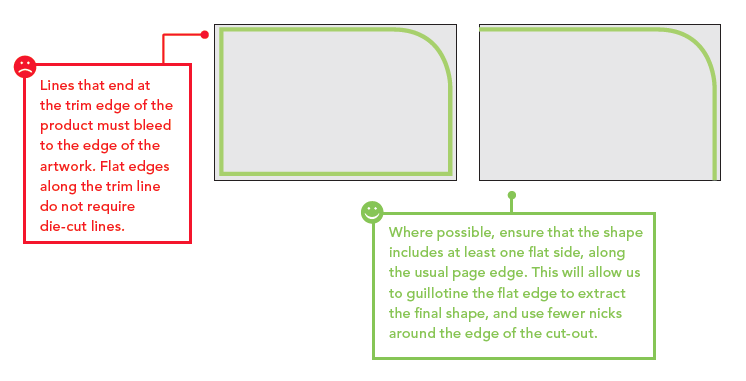
Please contact us if your shape doesn't have any straight (guillotined) edges so that we can understand what you're trying to achieve. It is more difficult to push out this type of shape, so if you require your print to be pushed out, this will add a small cost to your job. The cost is £5 per 1,000. The turnaround will increase by 1 day per 1,000 above quantities of 5,000.
Example: Die-cut Circle with No Straight Edges. This job would require 'pushing out' as the Guillotine cuts do not assist in releasing the shape from its skeleton.
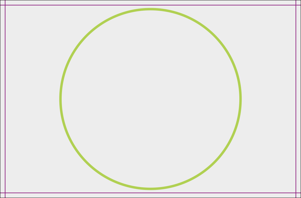
Example: Die-cut Rounded corners with No Straight Edges. This job would require 'pushing out' as the Guillotine cuts do not assist in releasing the shape from its skeleton.
-1.jpg)
Please choose a Round Corner Business Card if you require this shape.
To prevent a cut-out shape from ‘falling out' of the sheet, we will place small nicks in the cut lines. These nicks are made with a grinding wheel.
The more straight edges that we can cut at the guillotine later, the fewer nicks are required to hold the product in the sheet.
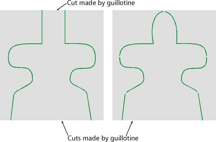
Left: Two straight edges = no nicks; Right: One straight edge = many nicks.
We will always use the minimum number of nicks required to keep the required shape intact until it is packed. If you wish the push-out shape remains intact during use, you should select one of the perforating options instead of a cut.
The minimum corner radius on a die cut is 3mm.
If you are designing a die-cut product that requires an acute angle, you must be aware that there is a minimum angle radius where the two lines meet into a point of 5 degrees.
Die Cut elements must be supplied in vector format.
You need to be able to place either one 45mm diameter circle, or two
non-overlapping 30mm diameter circles within your shape. This includes small shapes for pushing out.
The smallest circle that can be produced is 30mm in diameter, any other shapes must adhere to the above sizes.
When paper is folded, its interlinking fibres are compressed on one side and stretched on the other. If the outer fibres lose their hold on each other, we see this as 'cracking': an opening out of the paper on the outside. This will be more visually apparent when the design includes a dark colour across the crease. If dark colours are required please upgrade to a Laminated Product which will help to reduce the appearance of cracking.

We have produced some printed samples that demonstrate how to use Die Cuts, ask us for your free copies.
Centre radius may be between 10 mm and 65 mm from an adjacent straight edge.
If you need to have a hole drilled less than 10 mm from a straight edge, you may do so only if the position is 10–65 mm from another adjacent edge.
If you require more than one hole, each hole must be parallel and the same distance from one edge of the sheet (so no diagonally-aligned holes, or ‘Swiss cheese’ effects!)
On the artwork, place a cross (+) of diameter 2 mm to indicate the drilling position, line thickness 0.5 pt, and of a colour that contrasts with the background.


If the product you are ordering is going through the die-cutting process, any of our 'Shaped' products, then specify a punched hole instead of a drilled hole.
 When working with small text it’s best not to use colours which contain more than one ink. All printing presses have a tiny variation in the positioning of the different colour printing plates. It’s fine to use coloured text in headlines or type above, say, 10 point, but below that the blurring may be noticeable. The same thing happens when you knock white text out of a coloured background made from more than one ink.
Be careful if you are putting text over a photographic background as the text may be hard to read. To overcome this you may want to lighten or darken the image in an image editing package such as Photoshop. You may need to adjust the image more than you expect – always think to yourself “is it more important to see the image, or read the text?” If the text is more important, it may be best not to put it over the photograph at all.
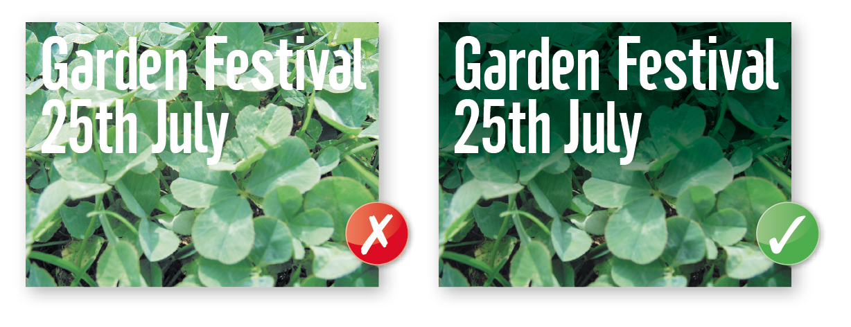 It’s fine to convert headlines and large text to curves, paths or outlines (which means that you won’t need to supply the fonts).
We really advise against setting text in a bitmap application like Adobe Photoshop® – the text will not be nearly as clear as if it were vector text from Adobe Illustrator® or Adobe InDesign®Also, Photoshop® by default does not apply any trapping, and thus the chances of mis-registration are increased.
We’d recommend that you keep your text above these minimum
sizes for each product:
‘Set-off’ is the marking of the underside of a sheet of paper caused by the transfer of ink from the sheet on which it lays. It can occur when pressure is applied during guillotining or simply while the paper is stacked. Set-off is caused by the fact that the ink is still wet, and is most prevalent on uncoated stocks like letterheads. Our process adds an extra gloss or silk coating to all jobs printed on coated paper. This reduces the likelihood of set-off occurring, but you should still be careful with which colours you choose, and in most cases you will be fine if you limit your choices to the colours on our colour chart.
As an example, a mid blue colour consists of 100% cyan ink, 72% magenta ink and 10% black ink. If we add these percentages together, we can work out that mid-blue has a total ink coverage of 182% (100% + 72% + 10%). The maximum ink coverage that is possible is 400% (which is of course 100%C, 100%M, 100%Y and 100%K).
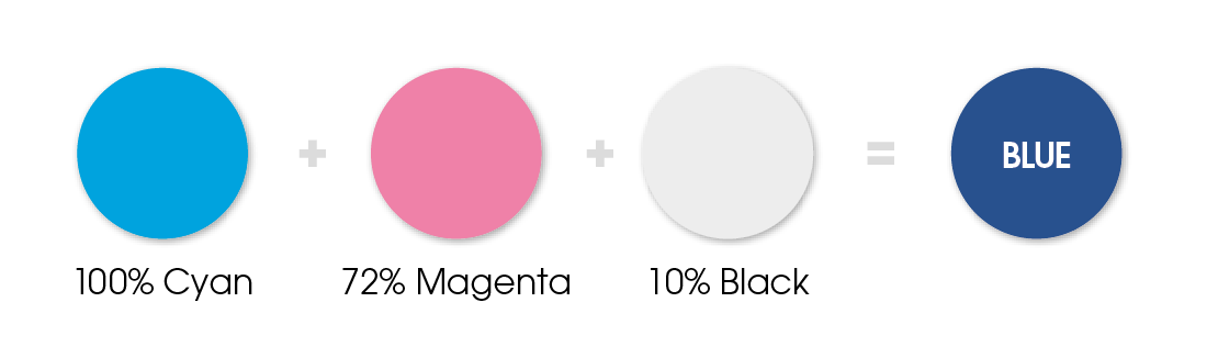
We have some guidelines to help avoid set-off. Our recommended ink coverage limit is 225%. This means that, wherever possible, the colours you use should contain a total of 225% or less when you add together cyan, magenta, yellow and black.
On coated stocks you can use colours made up of more than 225%, but less than 300% in smaller areas (such as small sections of images, headline text or logos) but you’ll run into problems if you were to use this level of ink on larger areas. Treat with caution, and if possible use lighter colours. Due to the nature and absorbency of uncoated  papers, avoid using above 225% at all on uncoated items such as stationery. Use the eyedropper tool in Photoshop, or the swatches palette in any vector packages, to check the darkest elements of your artwork.
Please don’t use colours above 300% – you’re putting a lot of ink on to the page, and our quick turnaround may mean that your job doesn’t have time to dry before it is cut. Please ask for advice if you are unsure about ink levels.
You may be surprised to learn that you can perform ‘GCR” (Grey Component Replacement) to minimise the amount of ink being put onto the page, but keeping the colour the same. This is explained on our Working With Photographs advice.
Black is black! Isn’t it?
It may surprise you to learn that there’s more to black than meets the eye...
To get the best from our process, black can be produced in two ways.
The first method is single colour black, made from 100% black ink. This is ideal for small areas less than 2cm square such as text or logos.

On areas of over 2 cm squared in size, single colour black can appear washed out and uneven. This is because the rollers on printing presses roll the ink off over a large area.
The alternative is rich black, which consists of 100% black and 40% cyan. A rich black should be used on larger areas to ensure an even, dark coverage, as the second ink colour disguises any inconsistencies. However, rich black should never be used on small text as any tiny deviance in registration will lead to a blurred effect.
Be aware that the higher the percentage ink coverage, the longer the drying time required. This is particularly true of uncoated stocks such as letterheads.
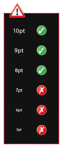
Black will inevitably appear duller on uncoated stock because of the
absorbency of the paper. This absorbency also means that any fine detail reversed out of black may disappear. We do not recommend less than 6pt text, for example, on uncoated stock.
You may think that it would be okay to have ‘three or four colour’black text as long as the total ink coverage is less than 300%. You’d be wrong! Black text should never have more than 140% ink coverage. “Four colour black” text is virtually impossible to print, will look blurred and may cause sheets to stick together.
 Also be aware that black within a photograph as a background may have a different CMYK make-up to other parts of your design. This will be noticeable when printed, even if not on screen. Placing a photograph with a black background over a black area in InDesign®, for example, may reveal a difference between the two shades of black when printed.
To overcome this, take a sample of the black that the background is required to match in an application such as Photoshop (use the colour picker tool). Then simply mix the matched colour in, say, InDesign® – paying careful attention to the overall ink coverage.
The images in your artwork are really important, so this section expains how to optimise them to ensure good reproduction.
 If you are sourcing photographs yourself, save them as either EPS or TIFF files as this will preserve the colour and clarity of your images - if you use JPG format then ensure that they are saved on the Maximum setting. If you are scanning a previously printed item, such as a magazine photo (obviously with permission from the copyright holder) or an old brochure you will need to ‘de-screen’ the image, blurring it slightly to avoid a moiré effect (see your scanning software manual for more details).
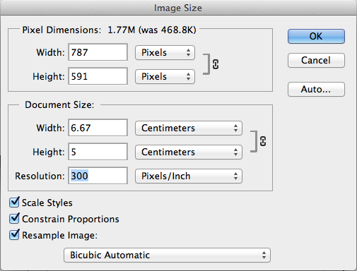 Consider the final size your image will be used at. Photographs should be 300-350dpi at the size you are going to use them. There’s no point taking a postage stamp at 300dpi and then blowing it up to a A4 size – for scans use your image editing software to help you calculate the output resolution. Conversely, images supplied at more than 300dpi will have no effect on the actual printed quality and will unnecessarily increase file size and processing time.
Don’t enlarge or reduce your bitmap images in your drawing/vector software (such as Illustrator) – it’s always best to use an image-editing application such as Photoshop for this task.
Black and white line art that has been converted to a bitmap (i.e. a logo) should be saved at 1200dpi for best results. Any lower, and the logo may look blurry. Pay careful attention to the CMYK makeup of any ‘black’ in your logo. The automatically-created Photoshop black, for example, is made up of varying percentages of CMYK. You may need to adjust the colour settings in your application to get a sharper black that is made from 100% black ink.
Colour settings and ink limits are applied when you convert your RGB images to CMYK in Photoshop, e.g. when selecting .
We’d recommend setting up the following colour presets to ensure your images print exactly as expected:
Using the wrong colour profiles, e.g. SWOP Coated, can result in your image printing with more magenta.
Using the wrong Dot Gain setting, e.g. 20%, may result in your image printing lighter than expected.
These settings are applied directly to the image; you do not need to embed the colour profile at the 'Save As’ stage.
To create these presets in Photoshop, select and then copy the screenshots below, then saving each preset for future use (e.g. one for Coated, and one for UnCoated).
.png)

You'll need to select the required preset each time you edit a Coated or UnCoated image. These settings are applied when converting RGB images to CMYK, and when adjusting the ink limit of existing CMYK images.
Converting RGB Images (to apply settings)
Select:
Converting CMYK Images (to apply settings)
Select:
You may need to apply a medium or maximum Black Generation setting, depending on the image. For more advice on converting images, please give us a call.
Make sure that any alpha channels are removed and that there is no compression present in your image files. LZW and ASCII encoding should be avoided. Don’t use DCS files, LAB colour, Duo-tones or Tri-tones either – convert them all to CMYK.
 Please don’t embed any colour profiling when saving your files from your image editing software. Embedded colour profiles may accidentally overwrite your colour settings leading to unexpected printing results.
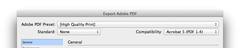
Our preferred file type is a High Quality Print (PDF 1.4). This can be saved from any of the industry standard graphics applications such as:
Other desktop publishing software may also offer an option to save or export a PDF:
If you are familiar with Adobe Distiller, we have some optimised settings that you can load in ready for PDF creation.
We'd recommend to avoid the 'drag and drop' online browser based PDF conversions, as these produce very low quality PDF files which may not print as you expect.
If your chosen software can't produce a PDF, then you may be able to save a 'flattened' graphics file such as a TIF, JPG or PNG file. If you are using this option, please ensure that you save the files at 300dpi resolution.
Yes, absolutely. We prefer PDF files, but if you don’t have one then we’ll be able to work with your native files. Please call us to discuss your project further.
Jump to contents page of
|
|||